Grey is the new Black
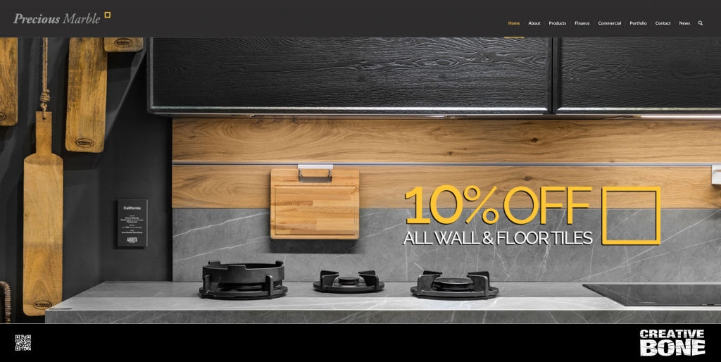
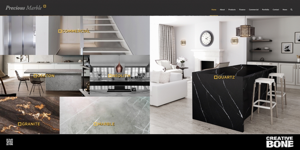
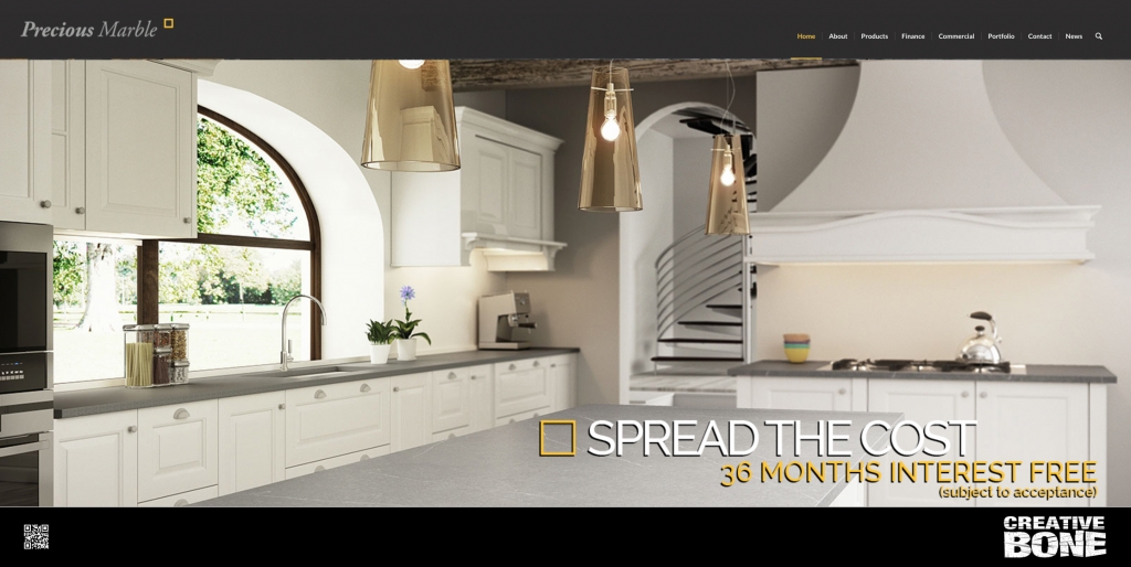
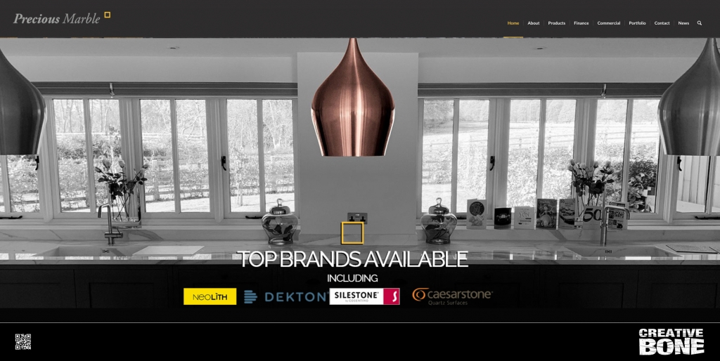
Long standing client Precious Marble came back to us for a website refresh. We had built their existing site over five years ago and they decided to give the site an update and a new homepage. We designed a mosaic frontpage with links to all the main assets up front and centre, went for a modern and contemporary grey background with a mix of grey shades to compliment and kept the brand yellow to punctuate the logo and calls to actions.
The client was very happy, there was zero downtime and the site looks and operated superbly on both desktop and mobile.
https://preciousmarble.co.uk



Leave a Reply
Want to join the discussion?Feel free to contribute!