Automated Exhibitionists
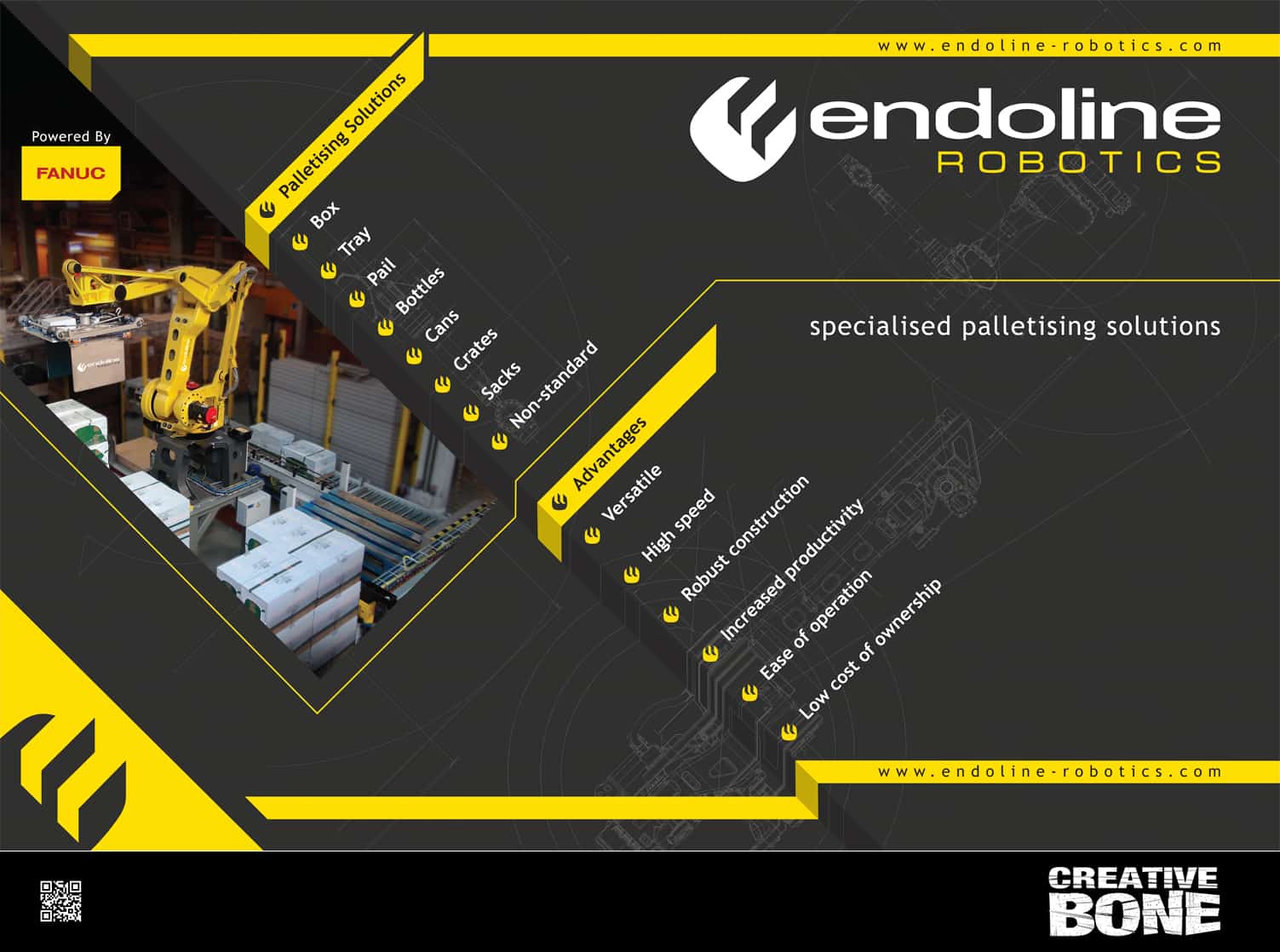
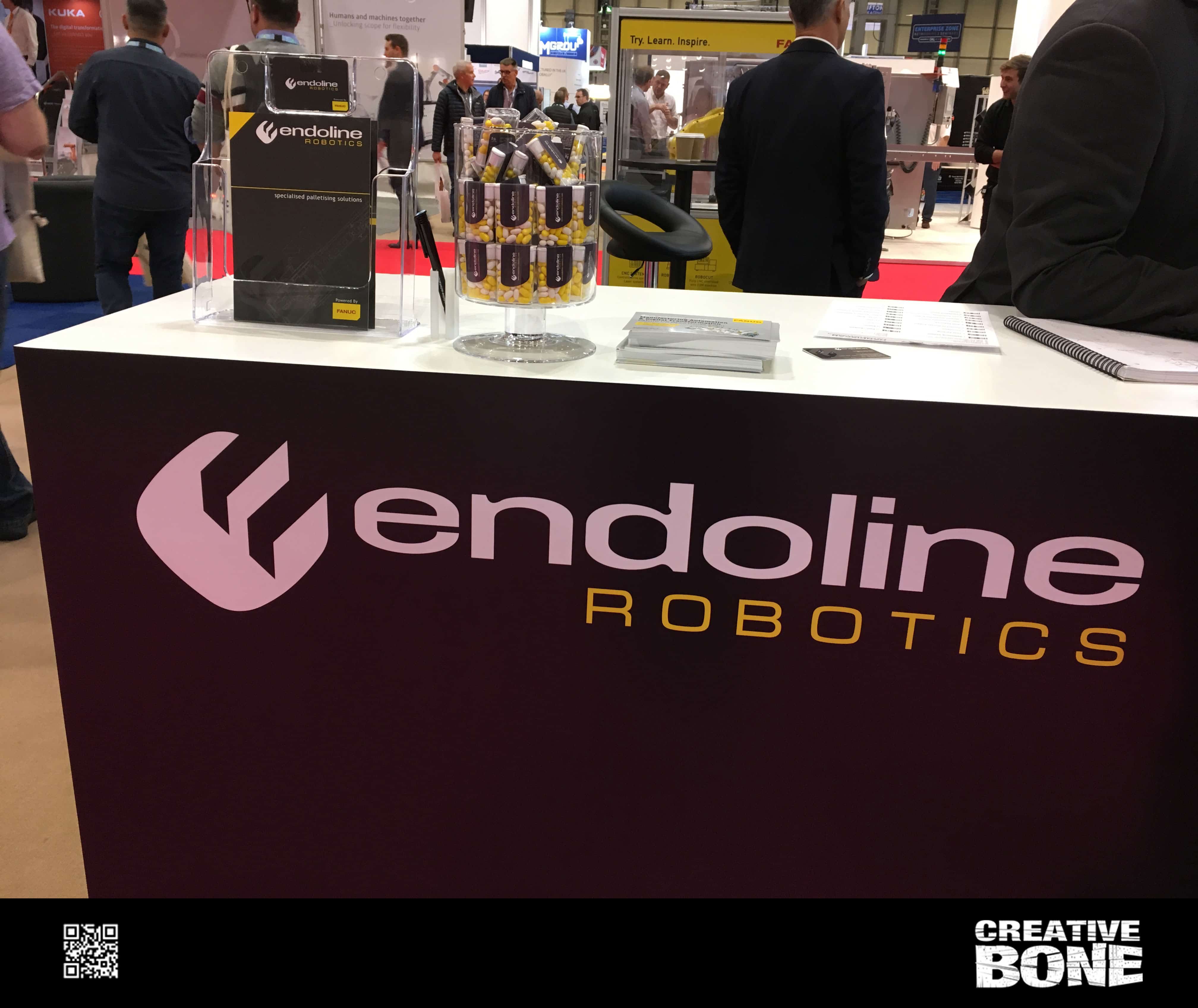
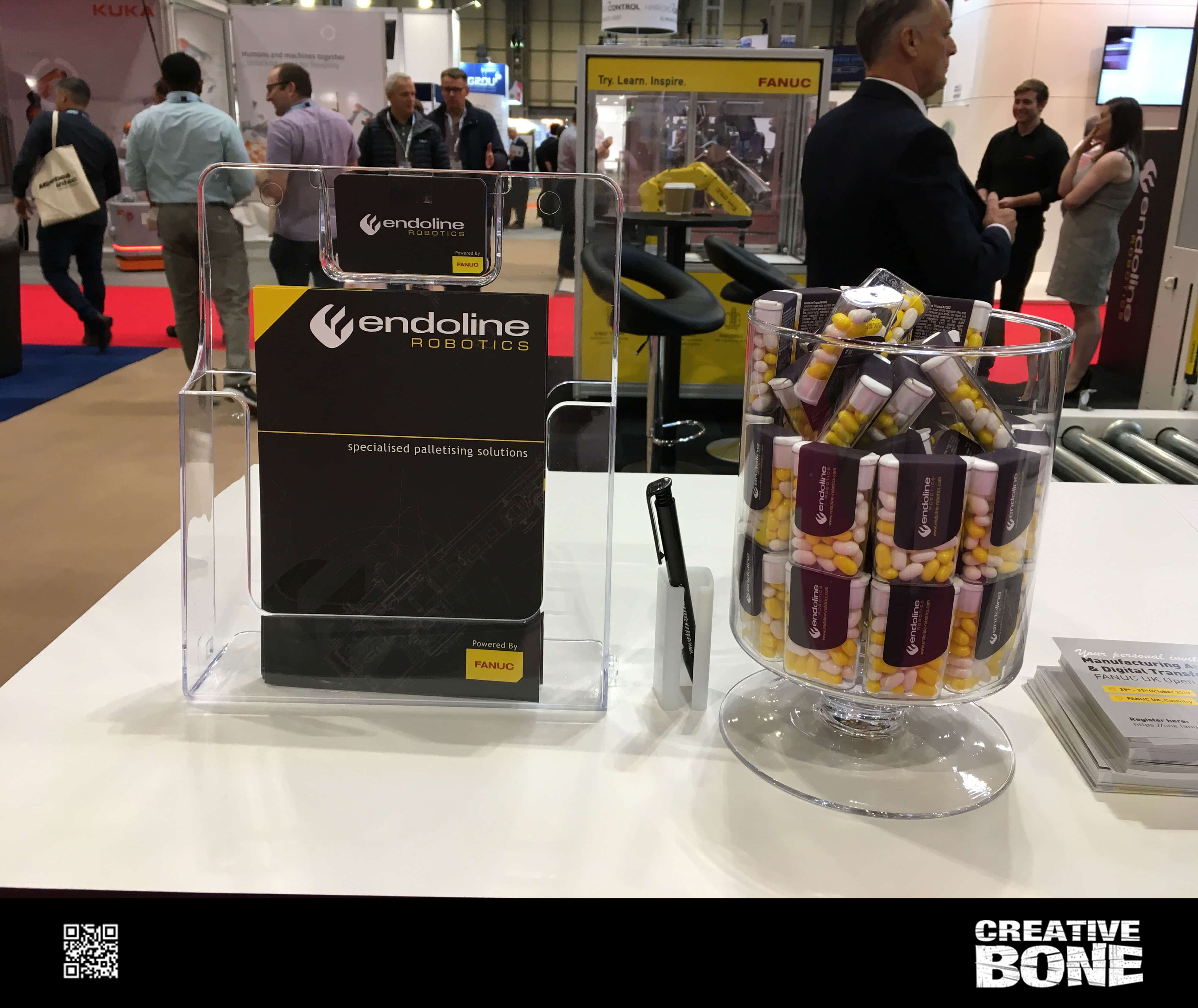
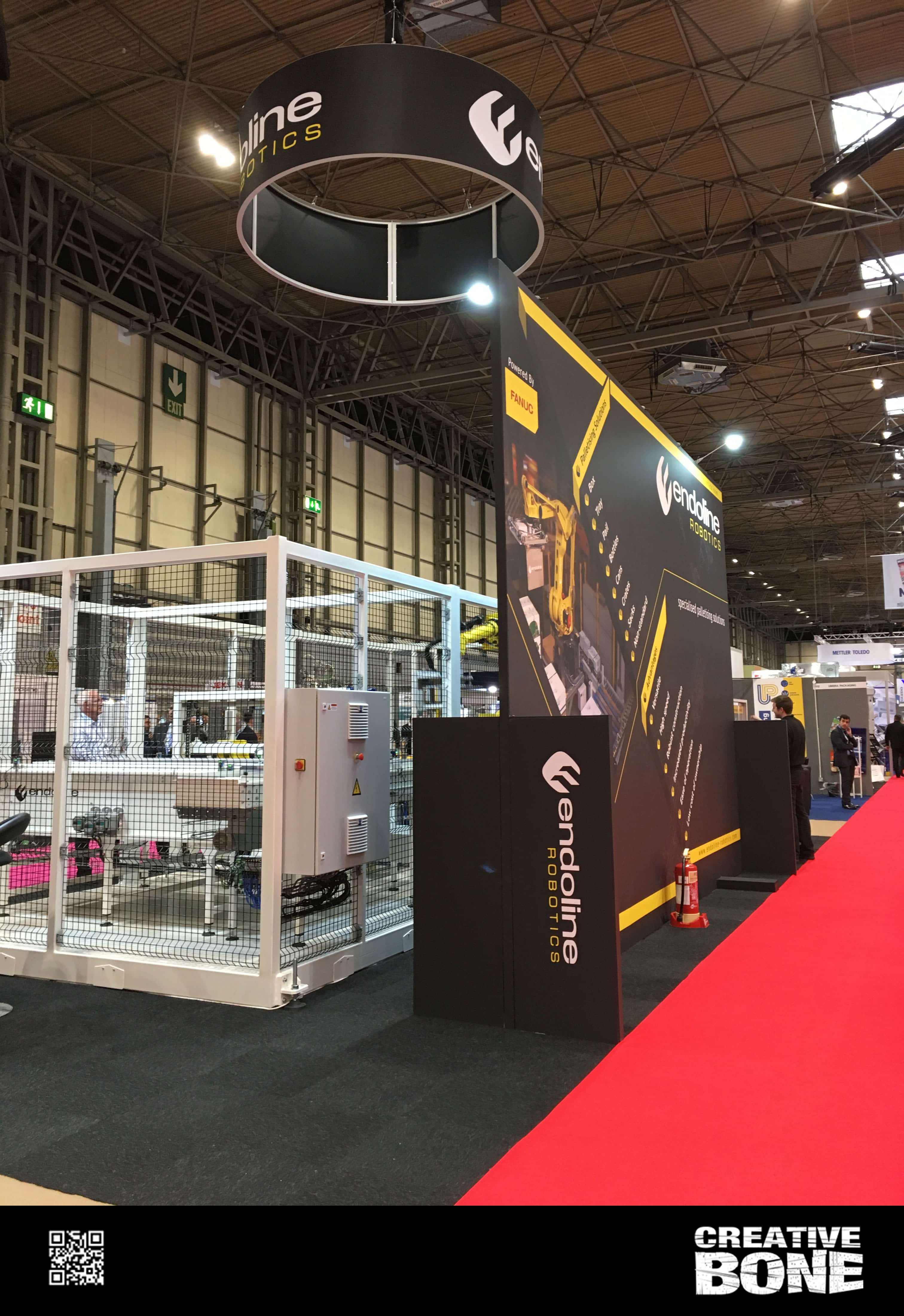
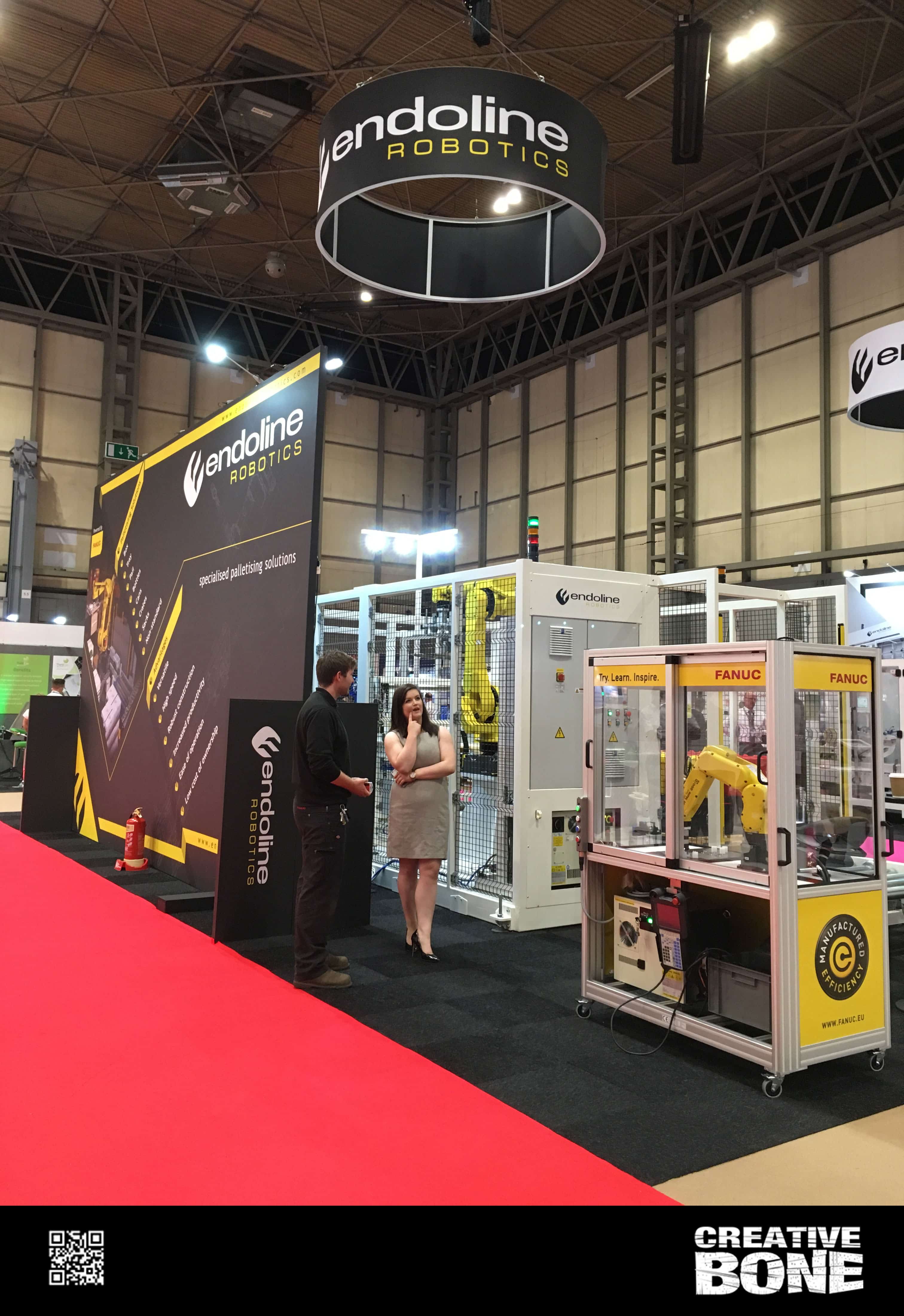
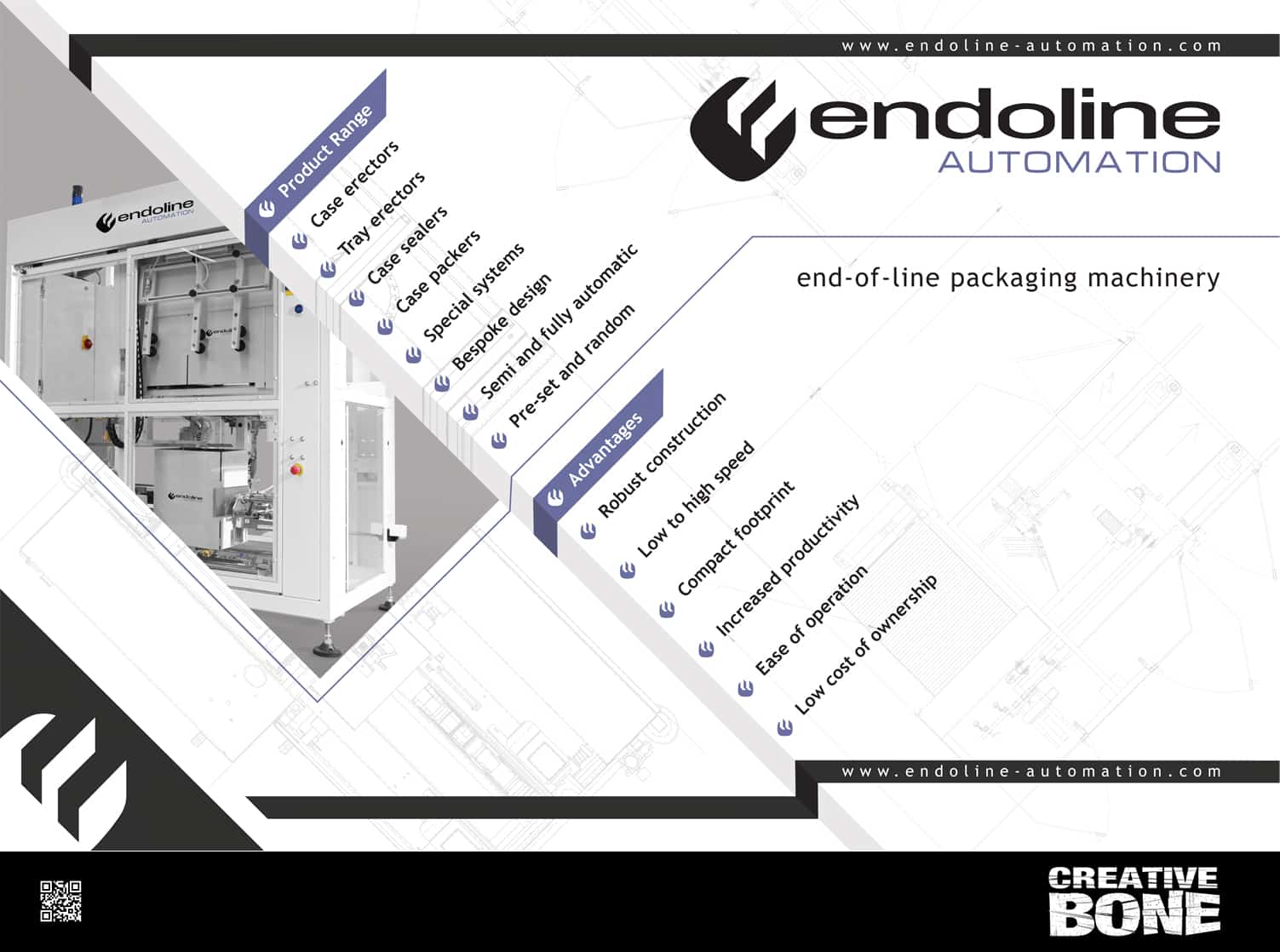
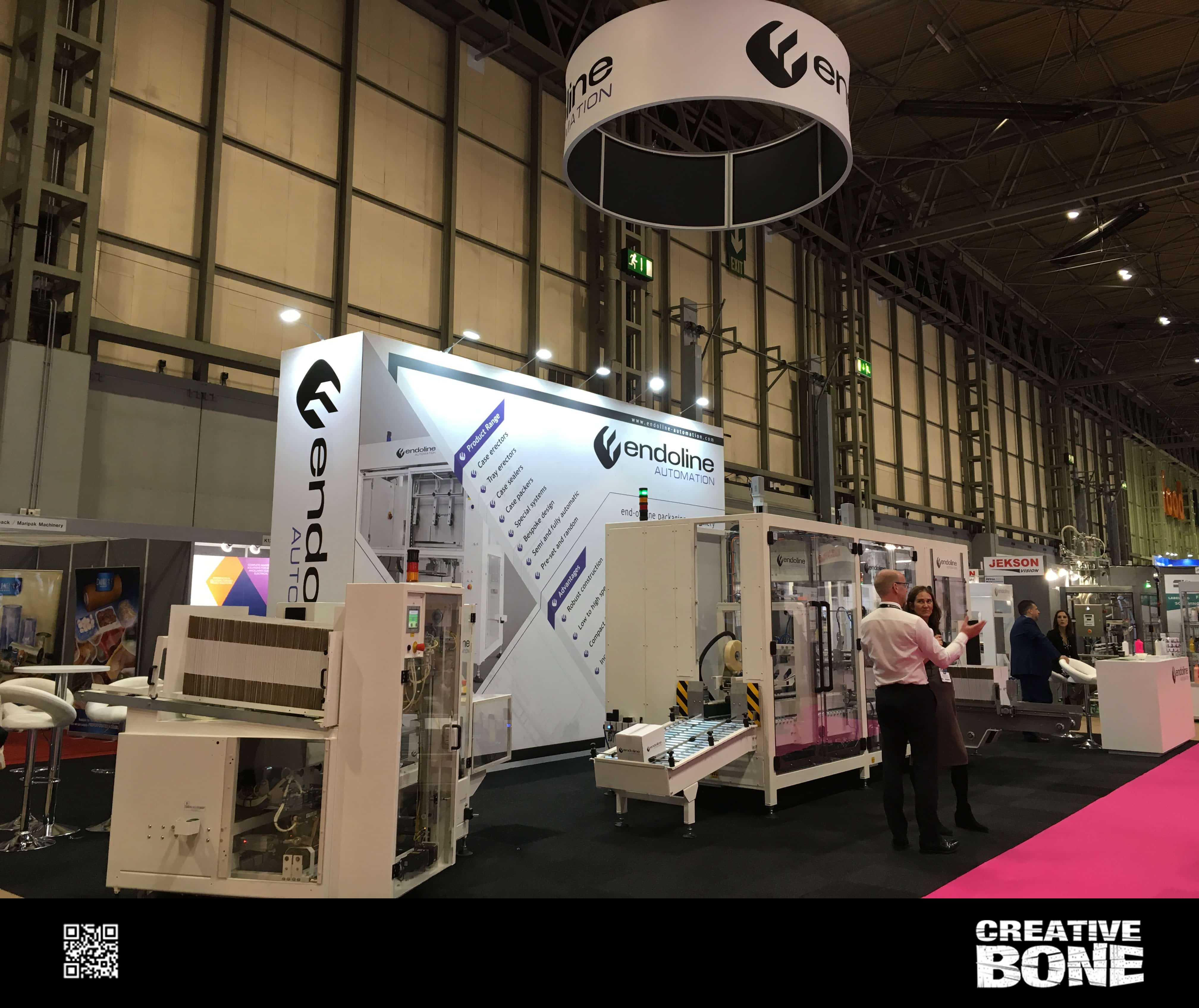
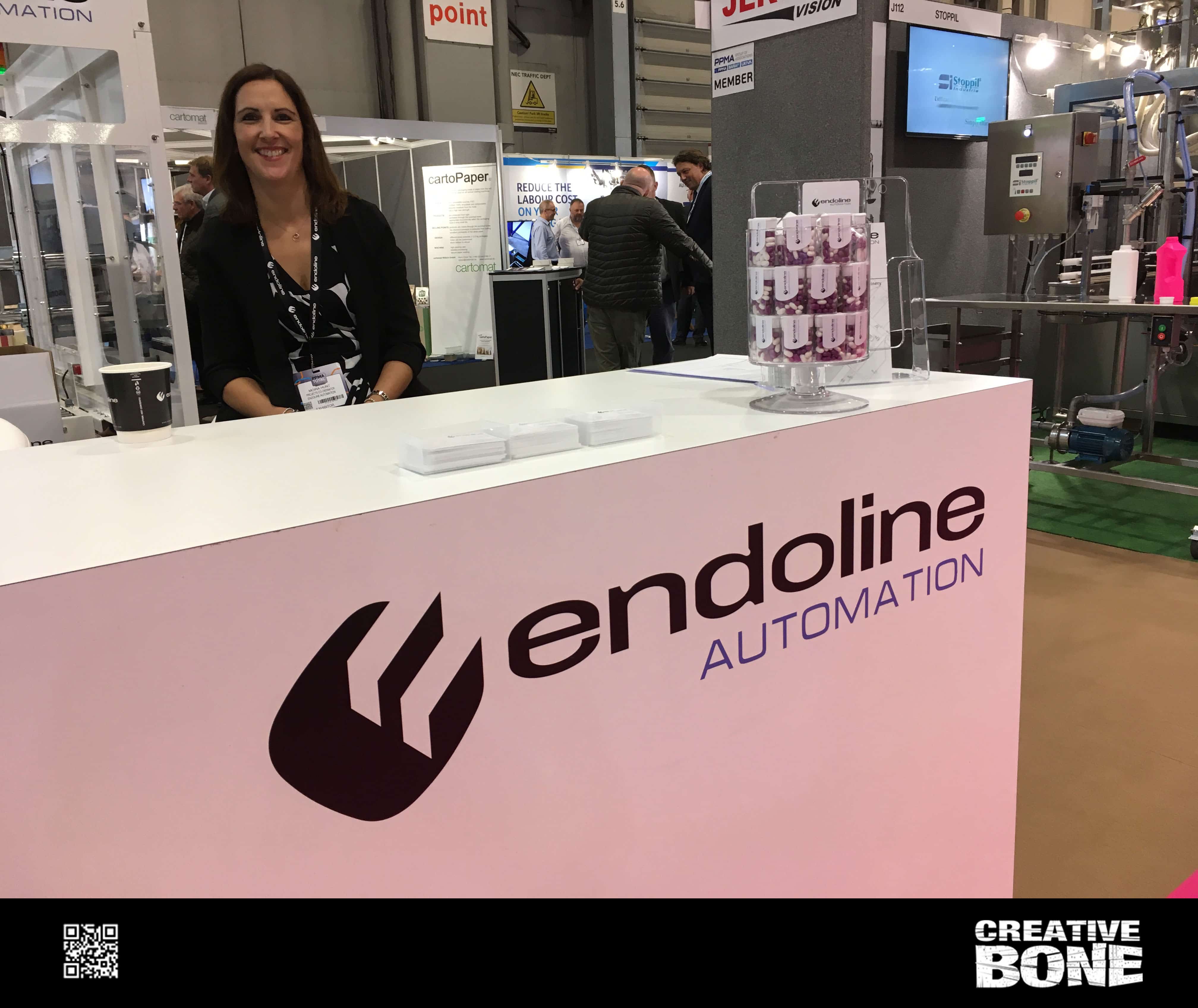
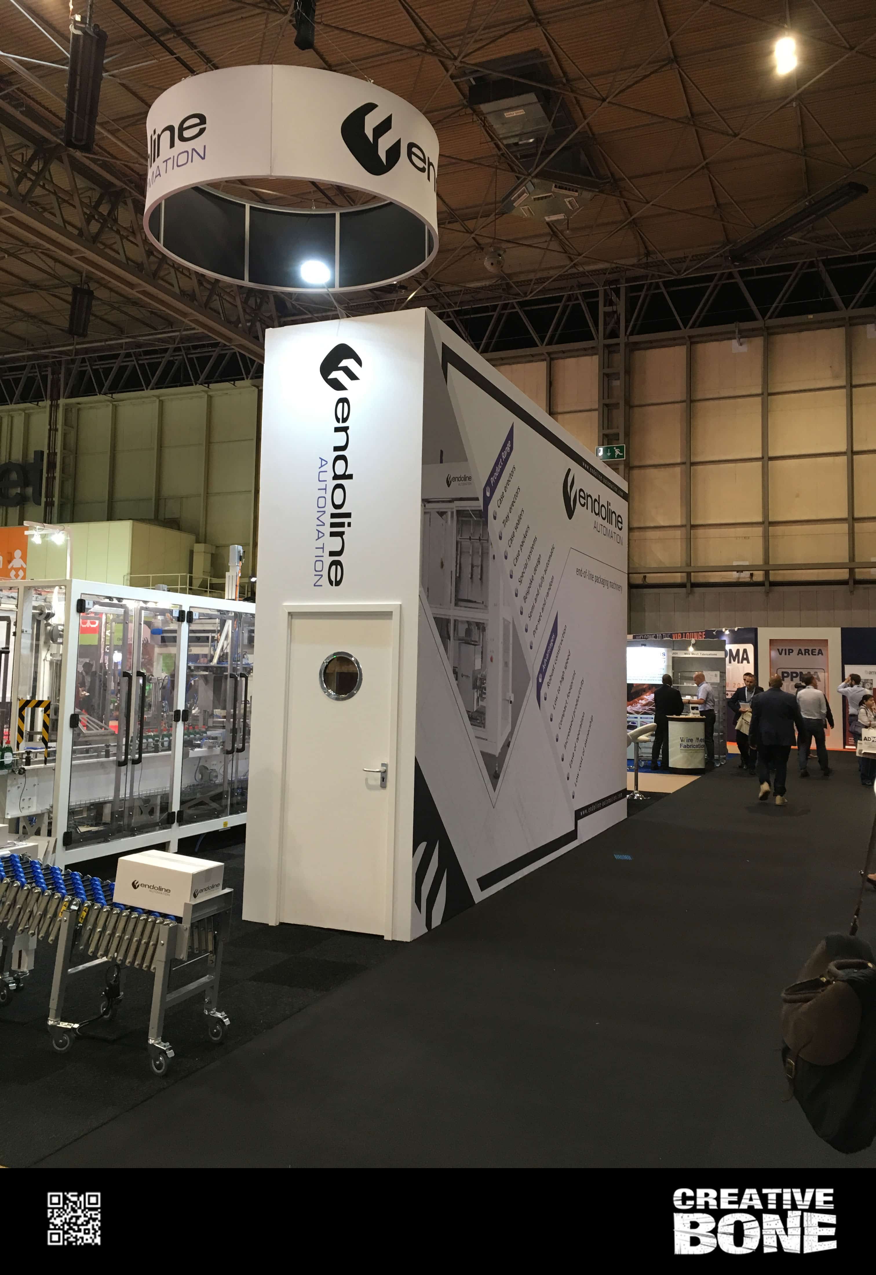
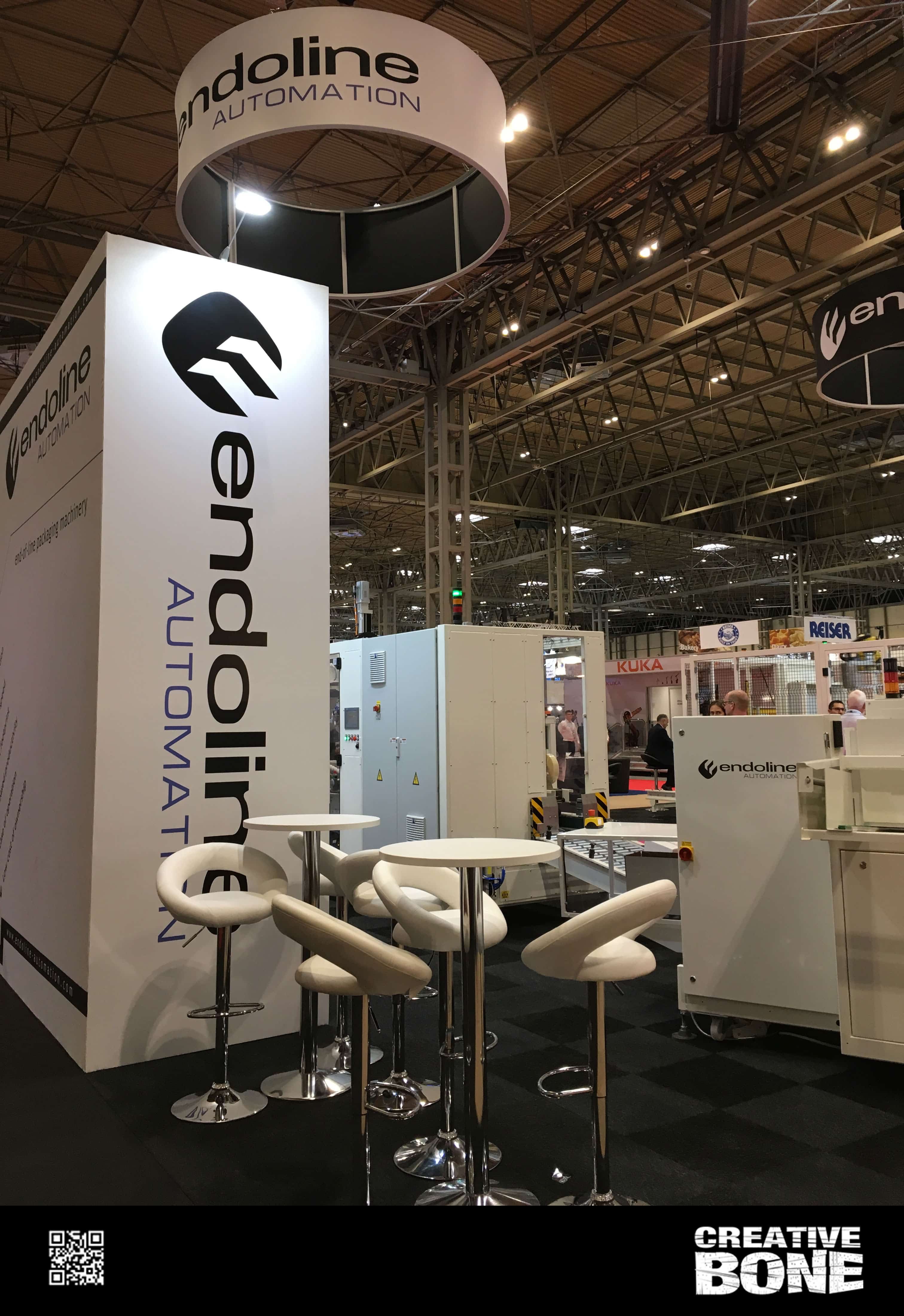
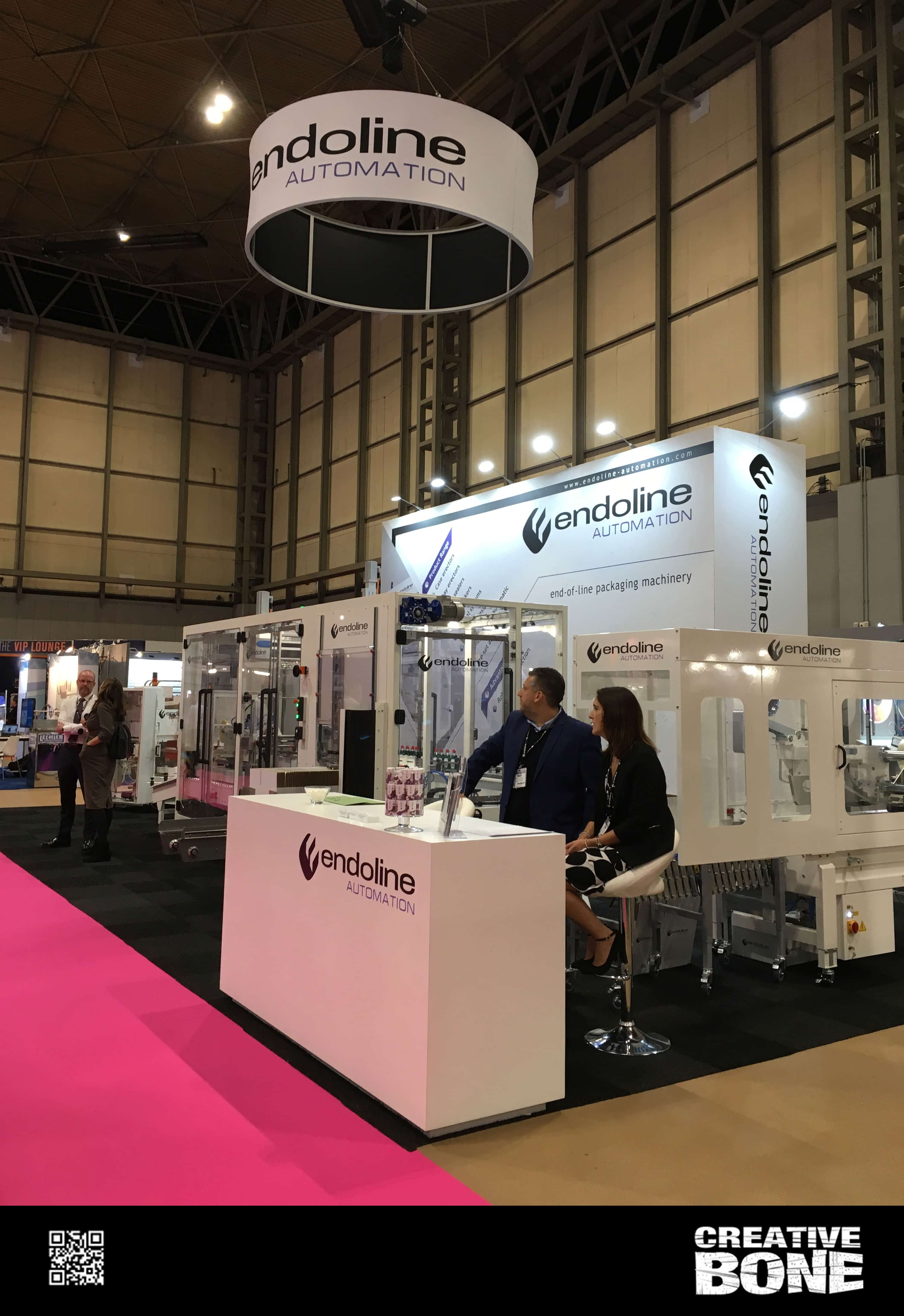
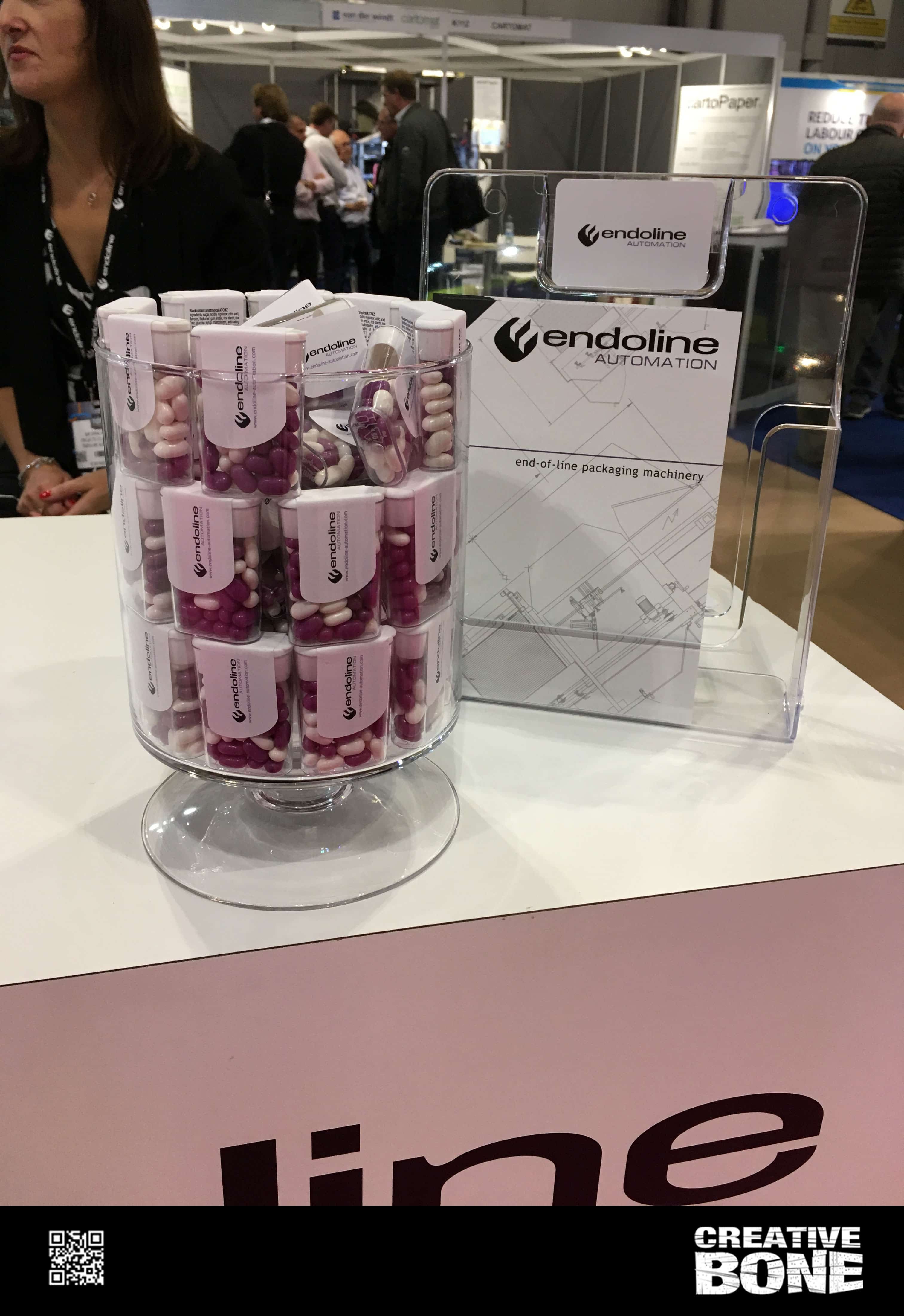
Jamie Hammond+/0 Comments/in Corporate Identity, Exhibition, Graphic Design/byWe were once again asked to produce exhibition artwork for Endoline Automation for PPMA 2019. This year they would be unveiling a new sister company (Endoline Robotics) and so it was decided that we would produce a yin/yang style piece for both brands, showing contrasting colour schemes but with a common thread. With both stands opposite one and other, the effect was very well received and once again a very happy client.
Absolutely Fab-ulous
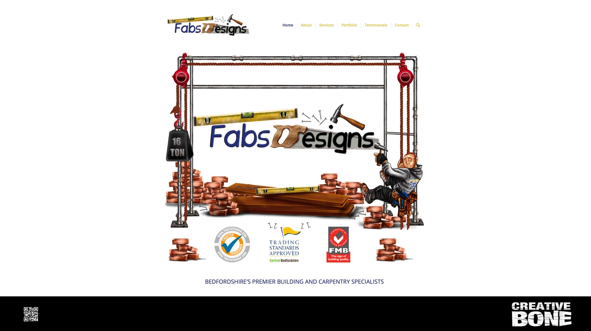
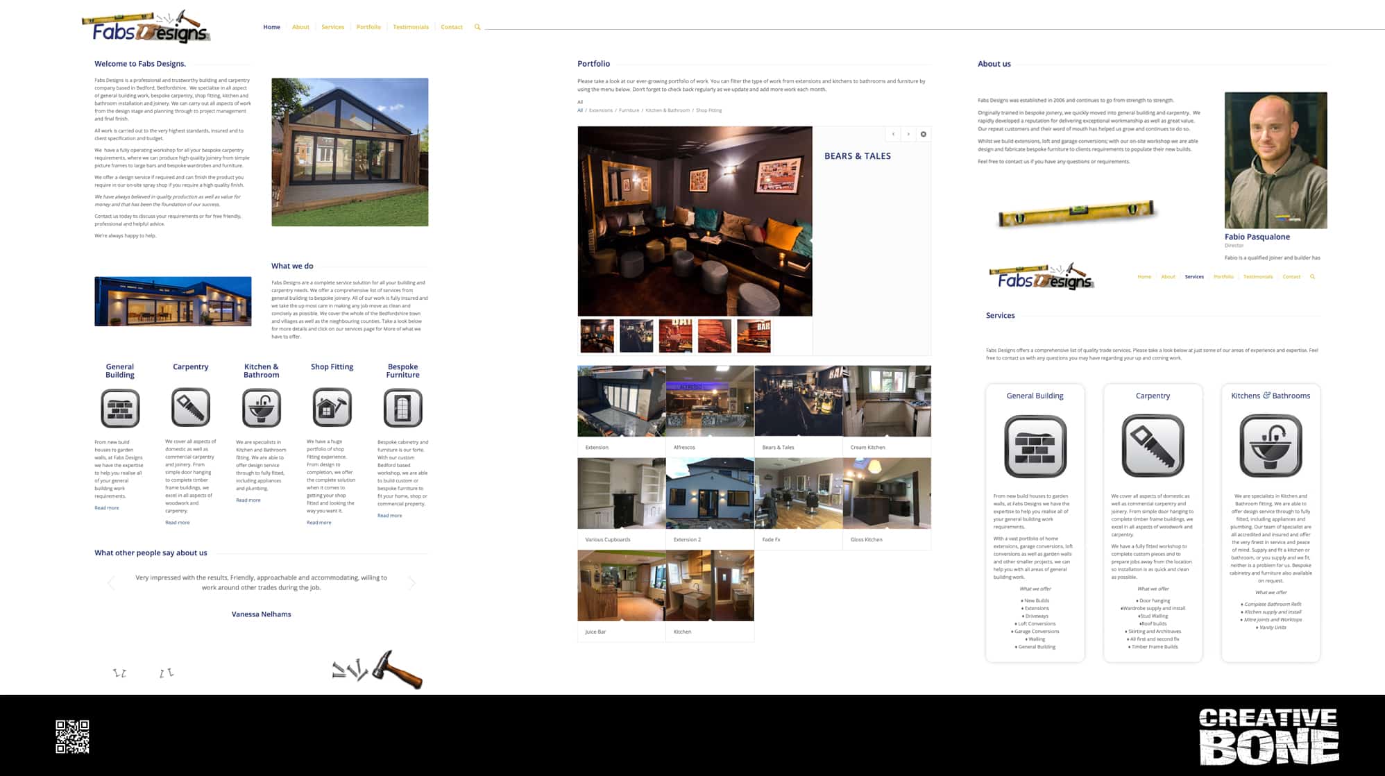
Jamie Hammond+/0 Comments/in Corporate Identity, Website Design/byWe had built Fabs Designs a very cool Flash based website over ten years ago. The business had grown considerably since then but changes in technology, the advent of more and more mobile surfing as well as browser stopping supporting flash, this meant that the site was well over due a make-over. The client wanted to keep the artwork we originally designed but wanted a mobile friendly version that was up to date and SEO friendly. The result was this very tidy and original looking website that the client was delighted with.
https://fabsdesigns.co.uk/services/
Bang Up To Date!
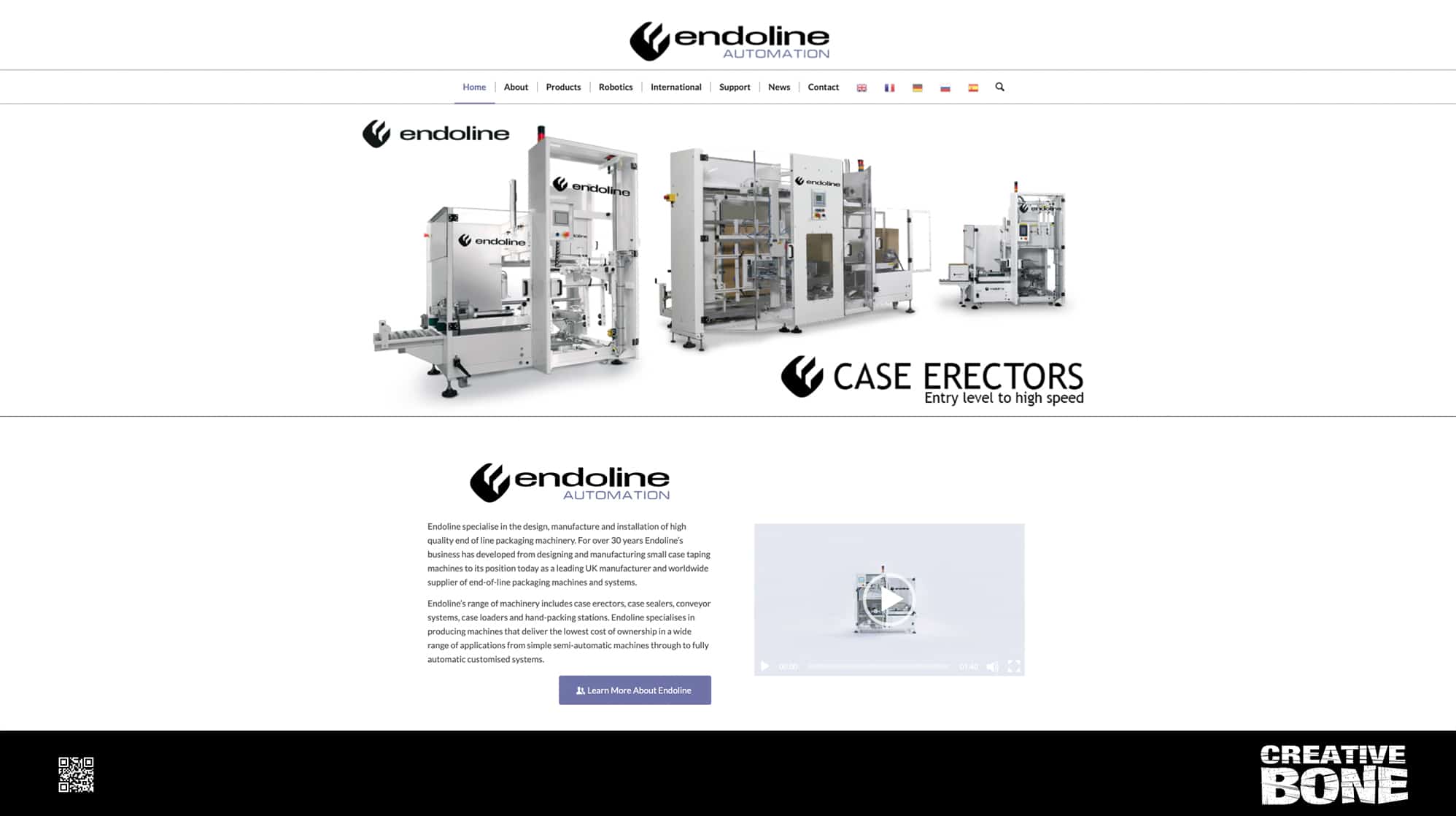
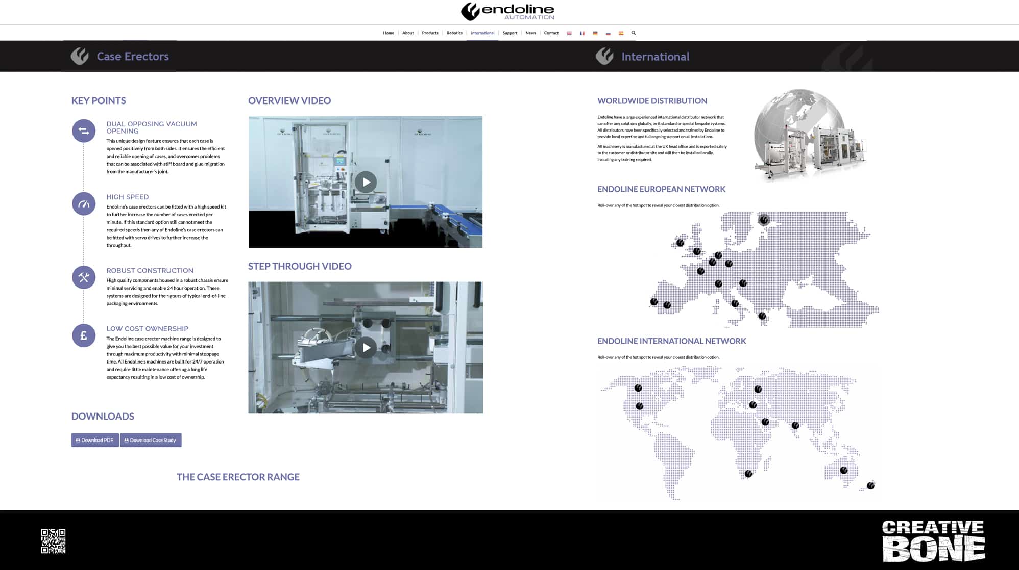
Jamie Hammond+/0 Comments/in Corporate Identity, Website Design/byWith the announcement that Endoline were creating their sister company, Endoline Robotics, we were tasked with updating the Endoline website. The client wanted to maintain the structure of the original site but bring the new branding into play. Clean and stylish with a Yin/Yang feel to complement the darker grey tones of Endoline Robotics, we bought new life to the website with simple nips and tucks, a refined colour palette and cohesive branding with the Endoline Robotics website.
https://endoline-automation.com
Stronger Together…
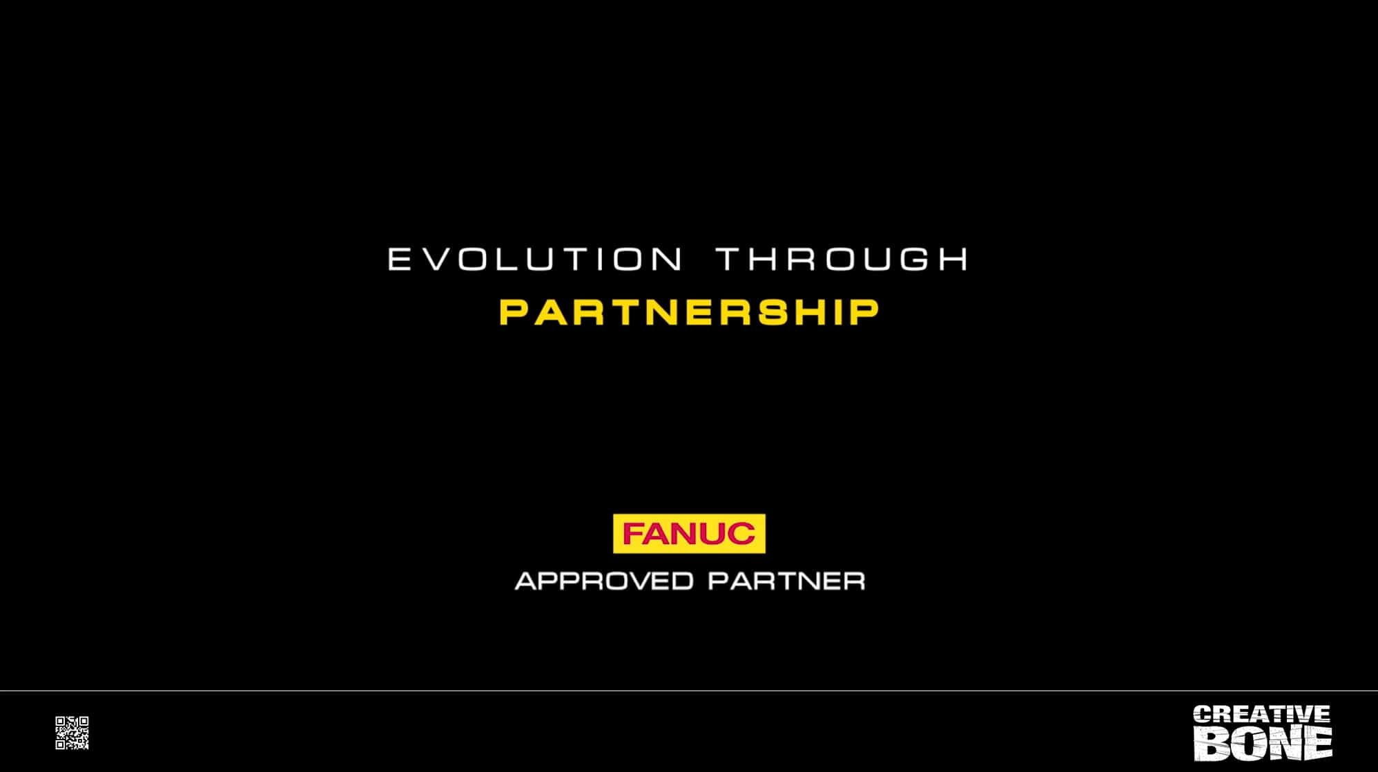
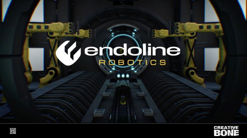
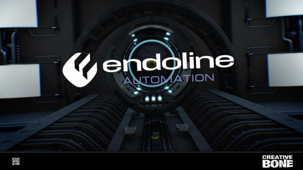
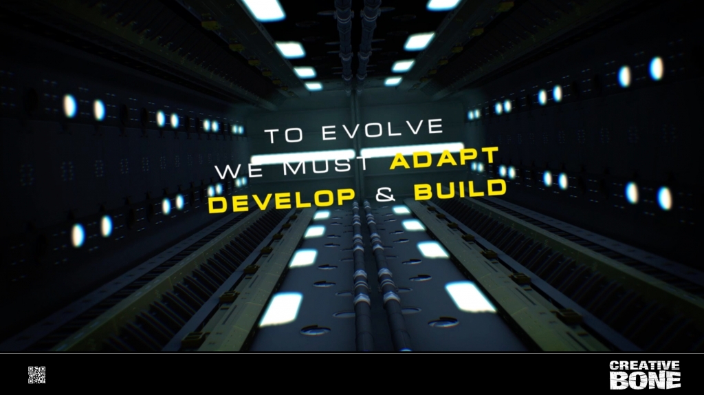
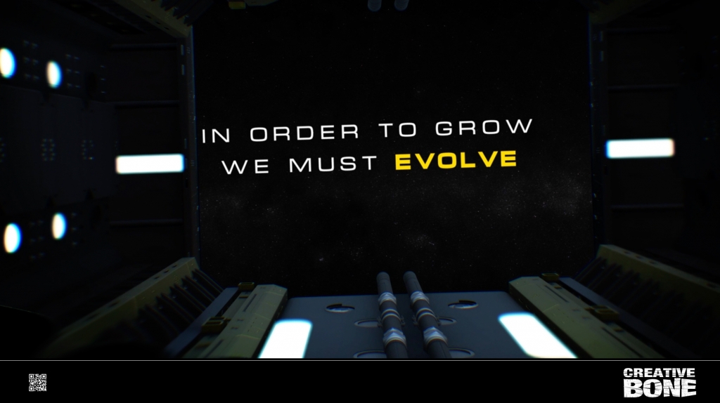
Jamie Hammond+/0 Comments/in Corporate Identity, Movie, Video Production/byEndoline wanted to produce a promo video that announced the arrival of Endoline Robotics, a new sister venture in partnership with Fanuc, a key provider of robotics systems. The ethos of the film was to show that strong partnerships can create exciting an new opportunities. We sprinkled in a bit of sci-fi magic and the end result was very well received.
https://www.youtube.com/watch?v=h30nzPKsMwU&feature=youtu.be
The robots are coming!!
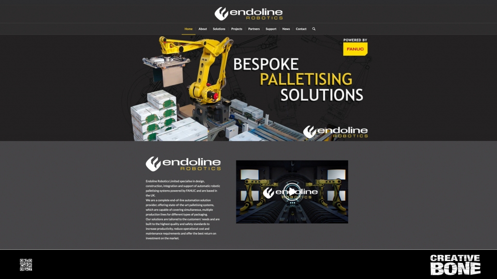
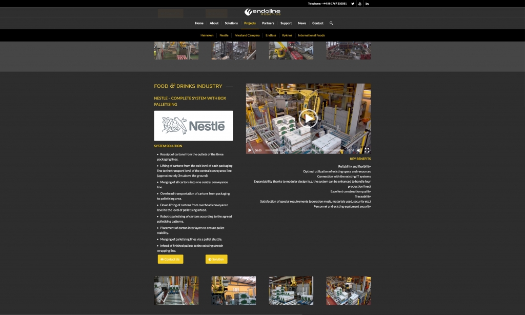
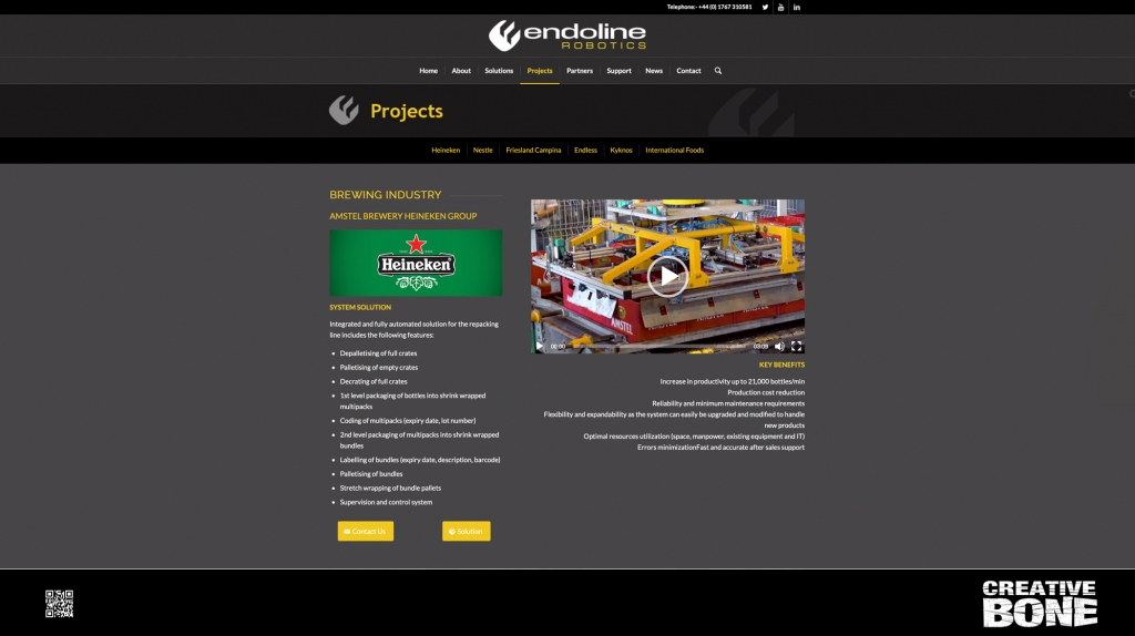
Jamie Hammond+/0 Comments/in Corporate Identity, Graphic Design, Website Design/byHaving a long-standing creative relationship with Endoline, we were tasked with bringing life to their brand-new business – Endoline Robotics. They wanted everything to scream Endoline but at the same time be something new and fresh. Keeping with the existing logo template we created various logo updates and colour palettes before settling on the chosen grey, white, black and yellow. The website had to have all the functionality of Endoline Automation but have an updated and refined feel to it. The end result sits very comfortably as a partner site to the original Endoline Automation site but with an identity all of its own.
https://endoline-robotics.com/contact/
Stone Cold Mailer
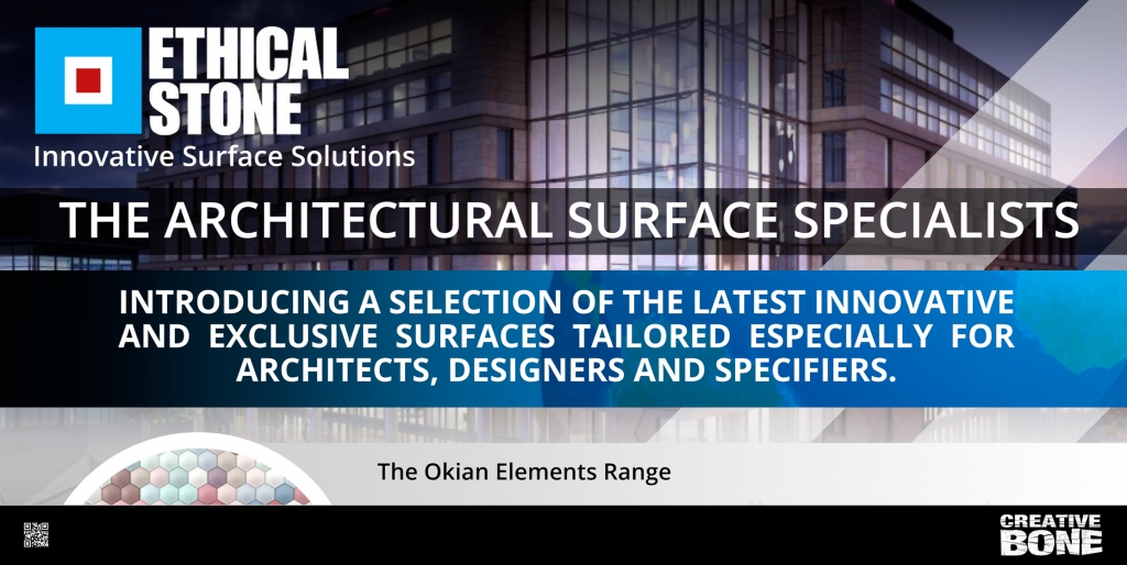
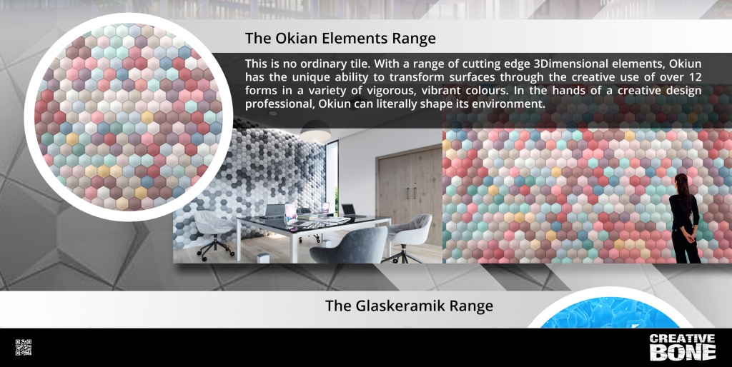
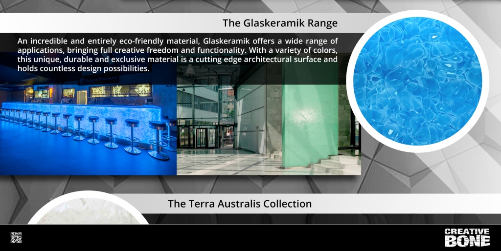
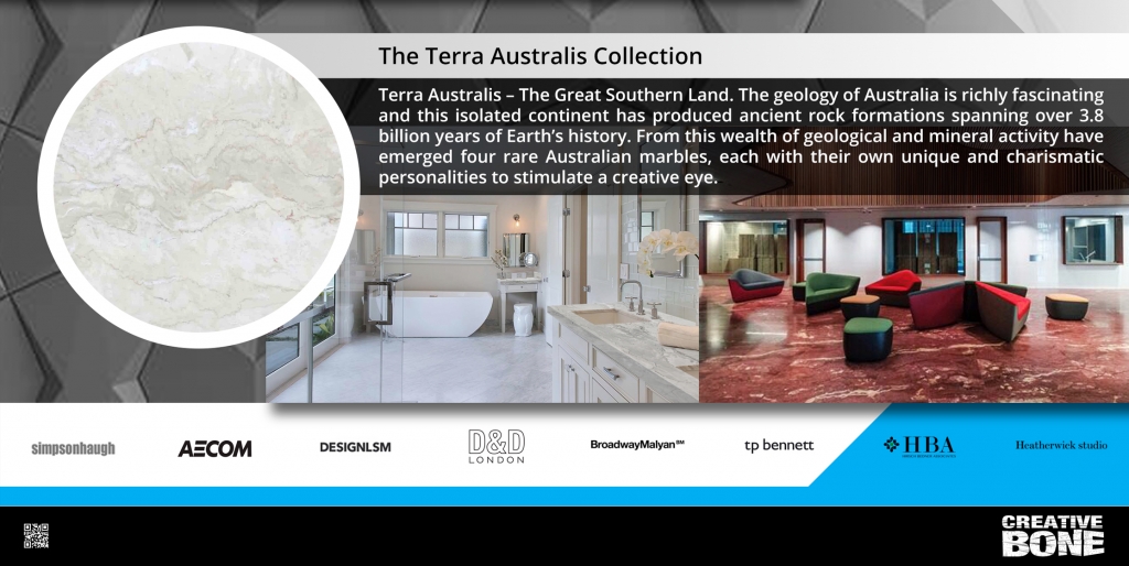
Jamie Hammond+/0 Comments/in Corporate Identity, Graphic Design/byCreative Bone worked recently with Ethical Stone to produce this mailer to advertise their new range of products to their online client base
https://www.ethicalstonecompany.co.uk
Modest Exhibitioner….
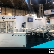
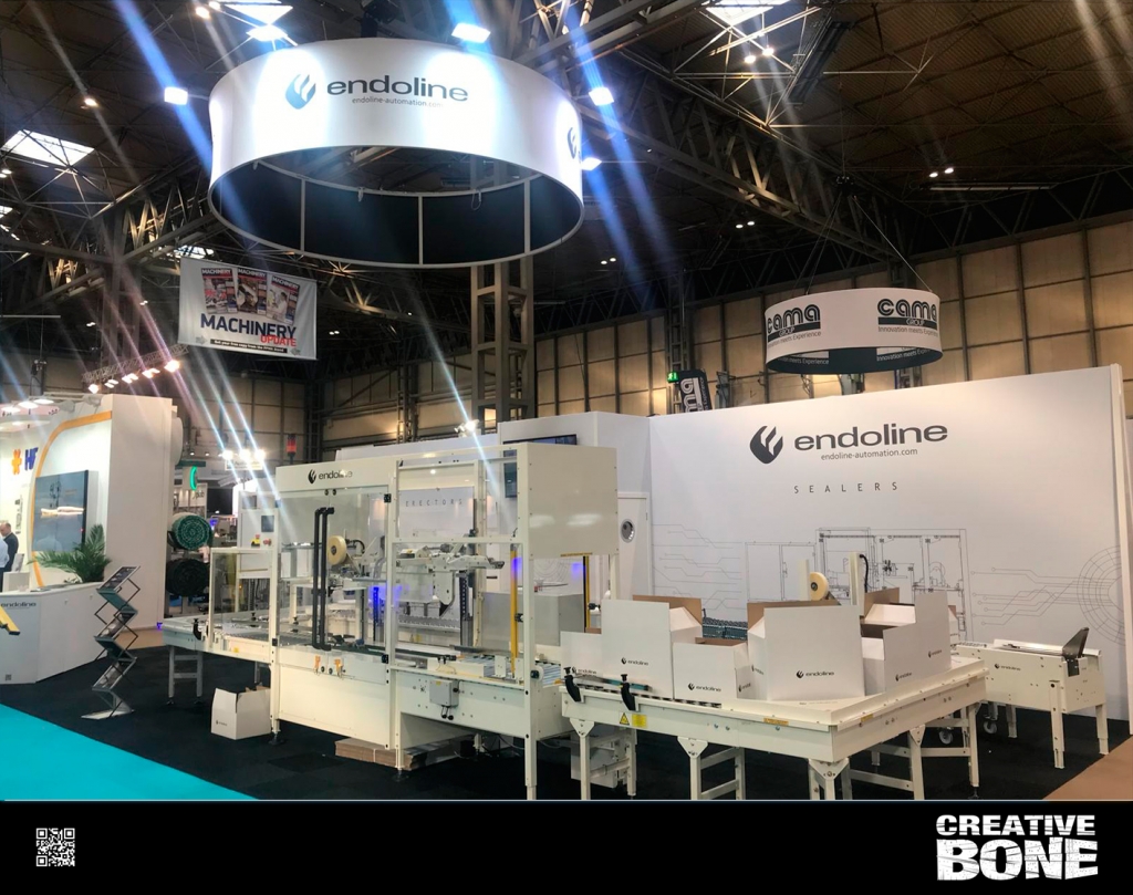
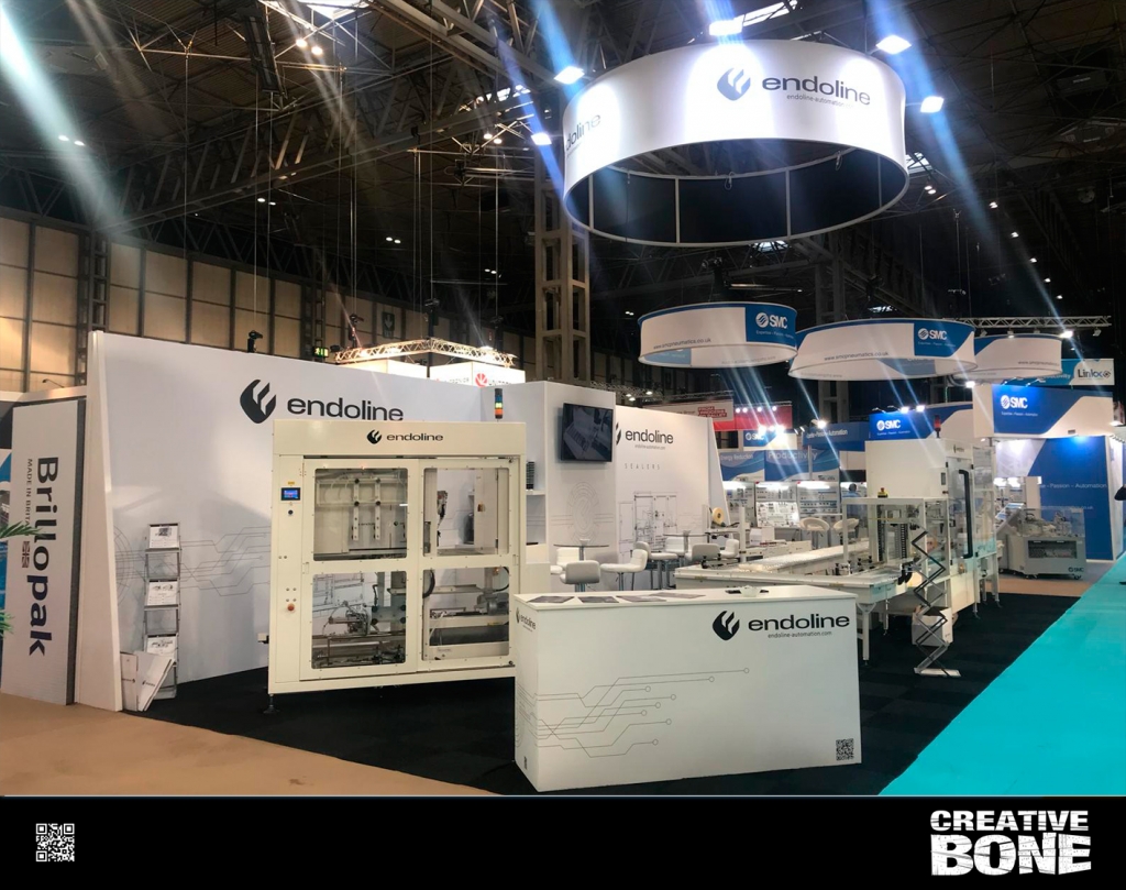
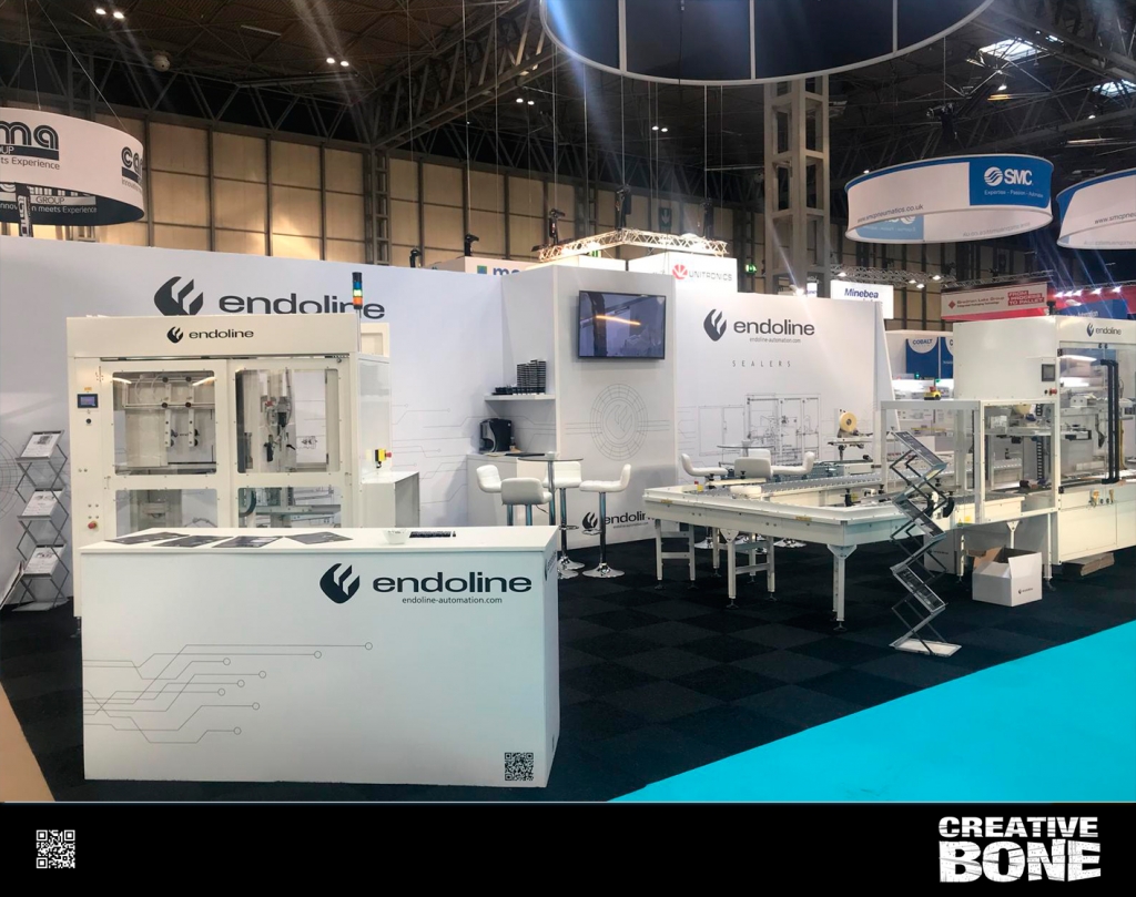
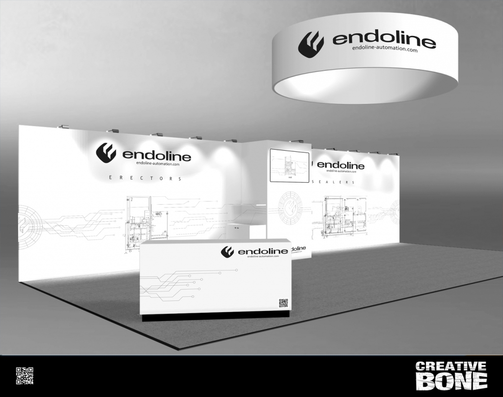
Jamie Hammond+/0 Comments/in Corporate Identity, Exhibition/byWe have worked with Endoline for many years, delivering a host of services from video content to website design as well as exhibition stand design. The hardest task when working with a long standing client is continuing to push the artistic boundaries, keep the designs fresh and engaging but also fully focused on the core brand ideals.
This year for the PPMA exhibition at the Birmingham NEC, the marketing head at Endoline wanted to keep the idea clean but modern, and so we built on the existing CAD artwork and created a minimalist design that felt organic as well as futuristic, but at the same time understated.
We think the design stands out well, was true to the brief and the client was very happy.
Big Screen Service For A Dark Night….
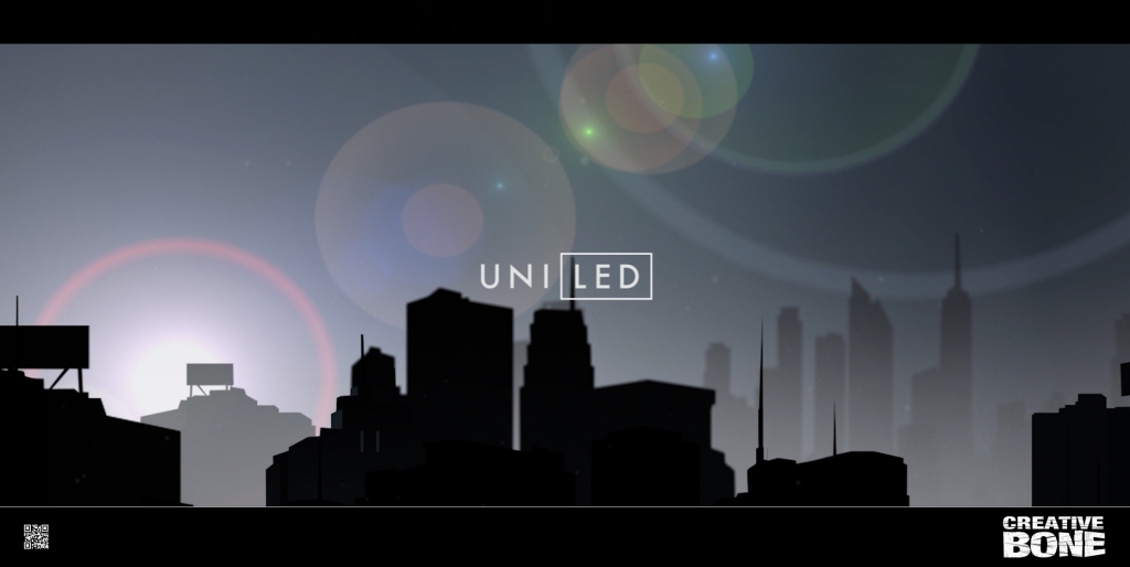
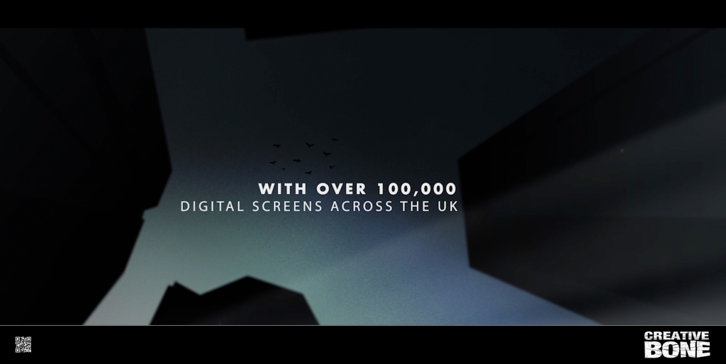
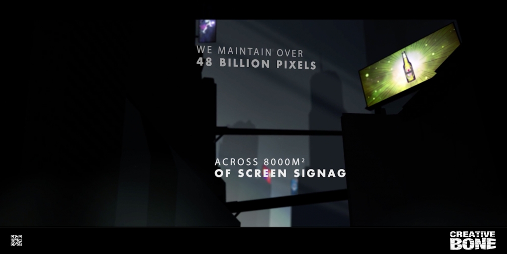
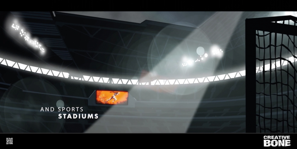
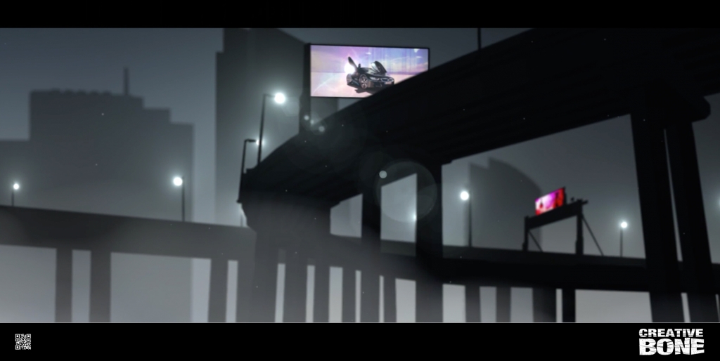
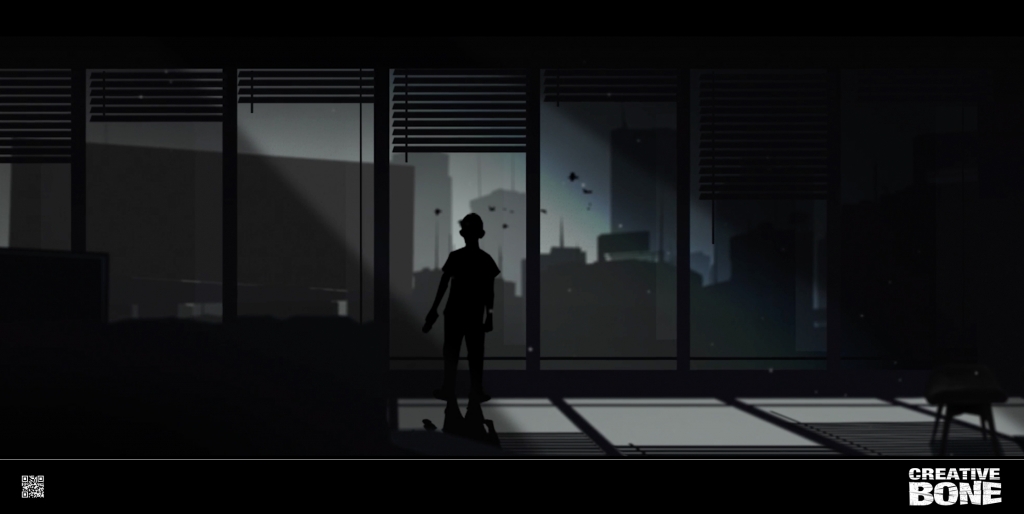
Jamie Hammond+/0 Comments/in Corporate Identity, Video Production/byWe produced this film for Uniled – a leading provider of digital signage service and repair in the UK.
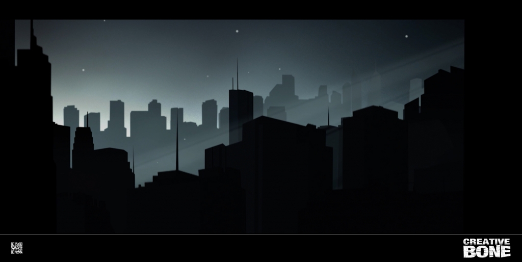
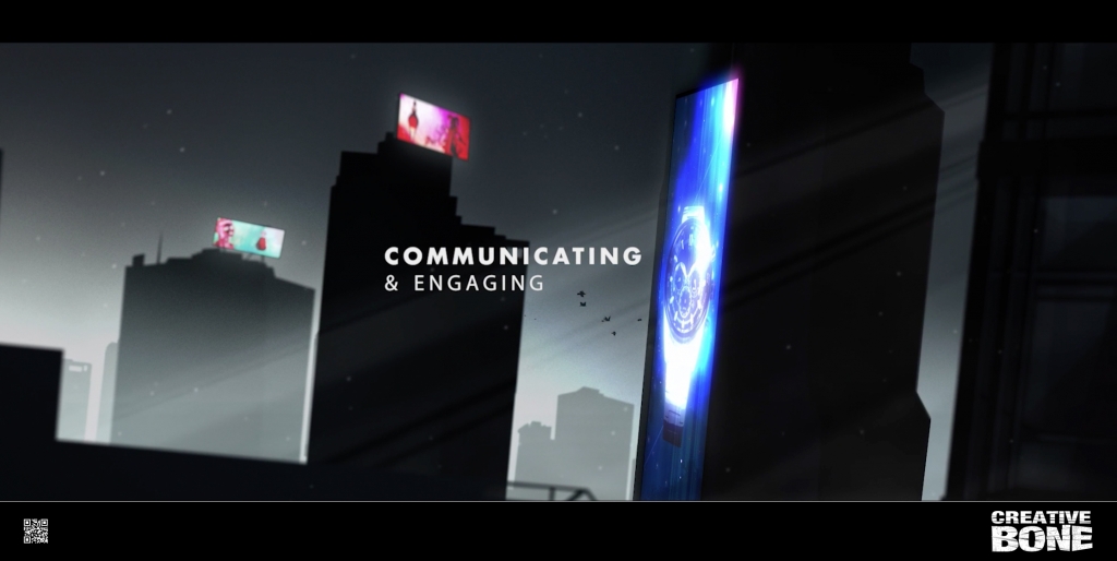
An underlying narrative tells the story of a young boy who views a digital signage screen from his apartment building everyday until one evening the screen malfunctions. Through the animated medium, stylised to show the only colour on offer is that provided by the screens themselves, we show the vast numbers of repairs required throughout the city and how fast, capable and reliant Uniled are in their service. The film culminates in the young boy watching as the screen comes back to life and his obsession becomes apparent.
This film was a complicated piece as there was a narrative that had to flow under a driven corporate message. A lot of artwork was needed to create a parallax environment that kept the camera moving and a murky colour palette that is juxtaposed by the bright colours of the screens that continue to burn through the night with the help of Uniled’s exceptional services.
Creative Bone
 Pimp My StormtrooperDecember 27, 2020 - 2:28 pm
 Staying Out For The SummerNovember 14, 2019 - 12:33 pm
 Automated ExhibitionistsNovember 14, 2019 - 12:30 pm
 Robotics On ShowNovember 14, 2019 - 12:29 pm
Categories
Archive
- December 2020
- November 2019
- September 2019
- June 2019
- October 2018
- September 2018
- April 2018
- March 2018
- September 2017
- August 2017
- April 2017
- March 2017
- December 2016
- August 2016
- July 2016
- March 2016
- February 2016
- January 2016
- December 2015
- November 2015
- October 2015
- September 2015
- August 2015
- July 2015
- May 2015

