Absolutely Fab-ulous

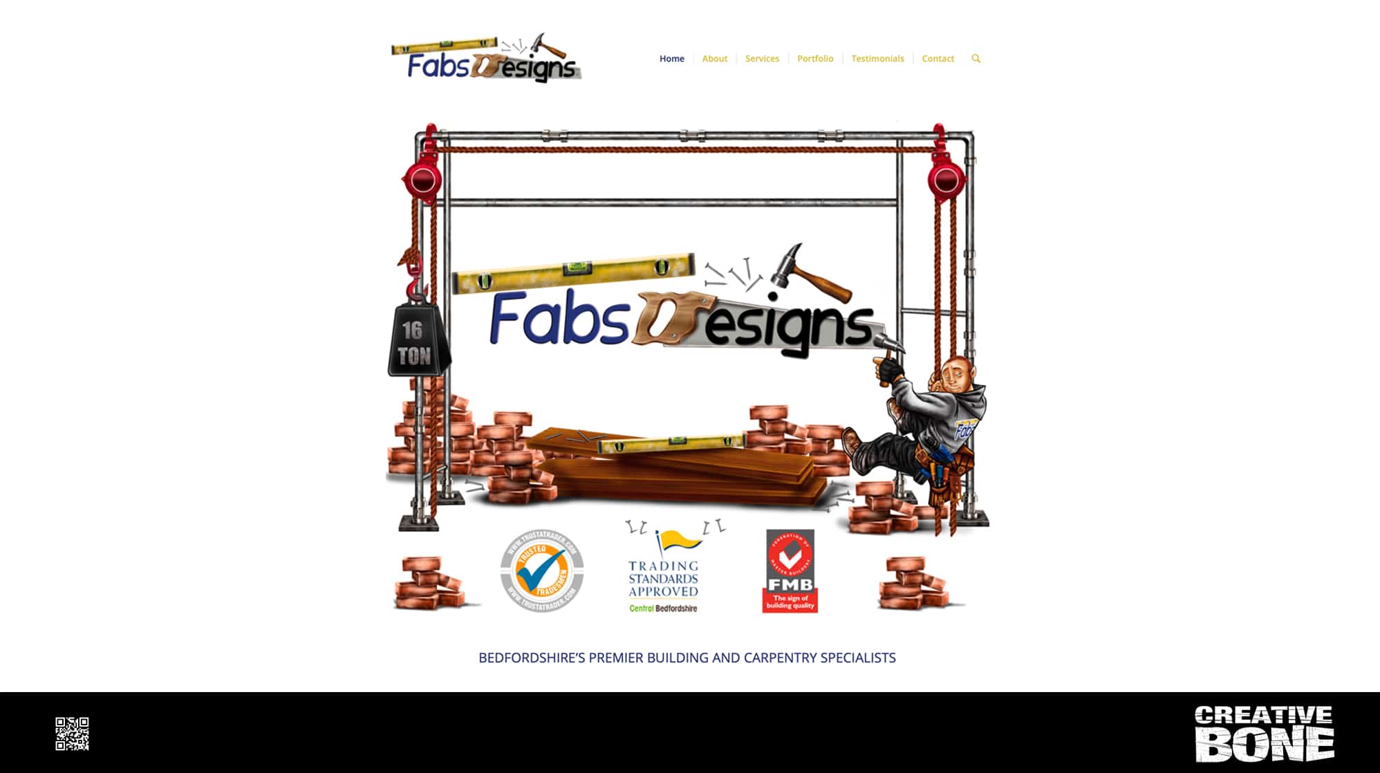
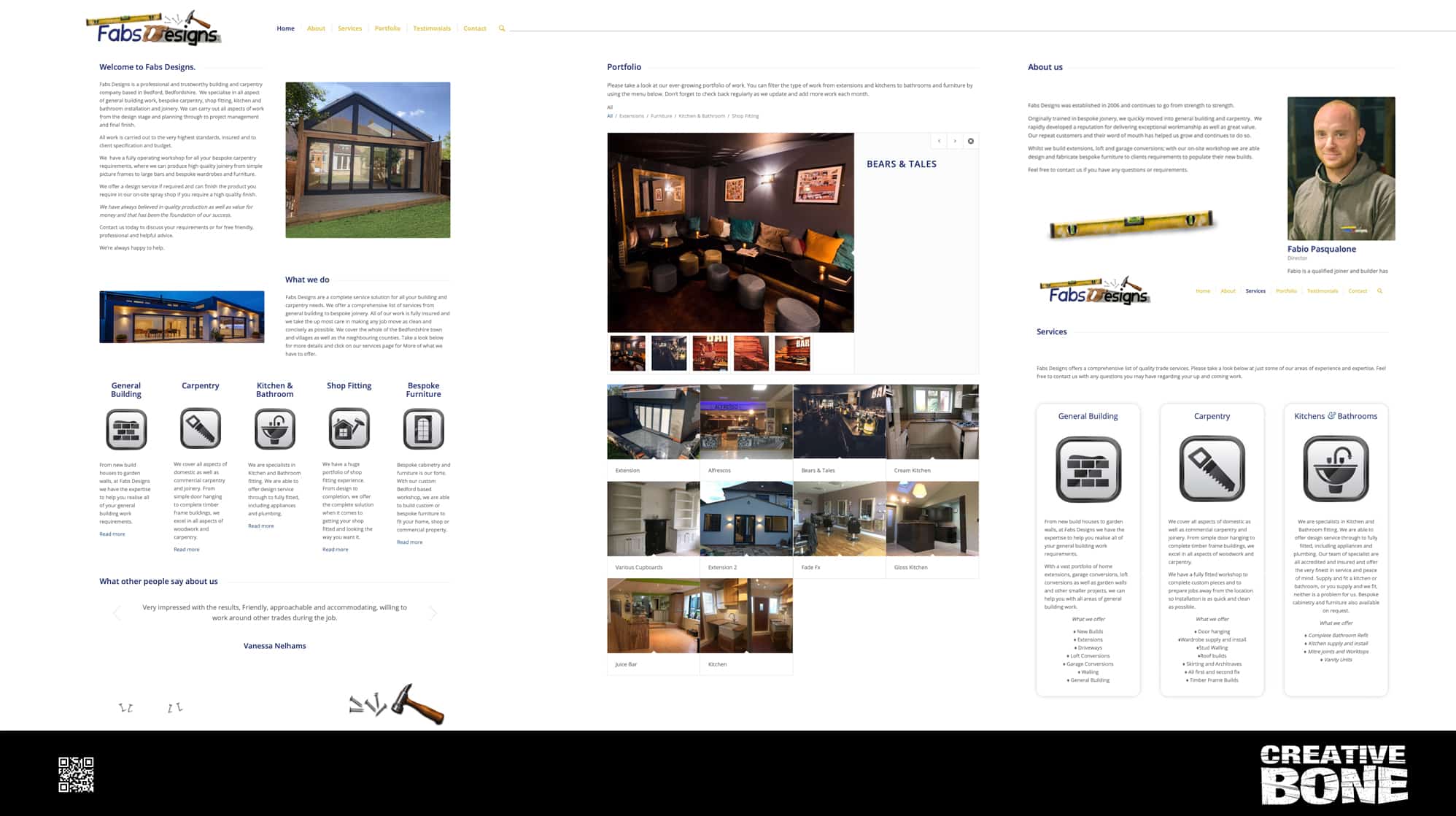
We had built Fabs Designs a very cool Flash based website over ten years ago. The business had grown considerably since then but changes in technology, the advent of more and more mobile surfing as well as browser stopping supporting flash, this meant that the site was well over due a make-over. The client wanted to keep the artwork we originally designed but wanted a mobile friendly version that was up to date and SEO friendly. The result was this very tidy and original looking website that the client was delighted with.

https://fabsdesigns.co.uk/services/


Bang Up To Date!

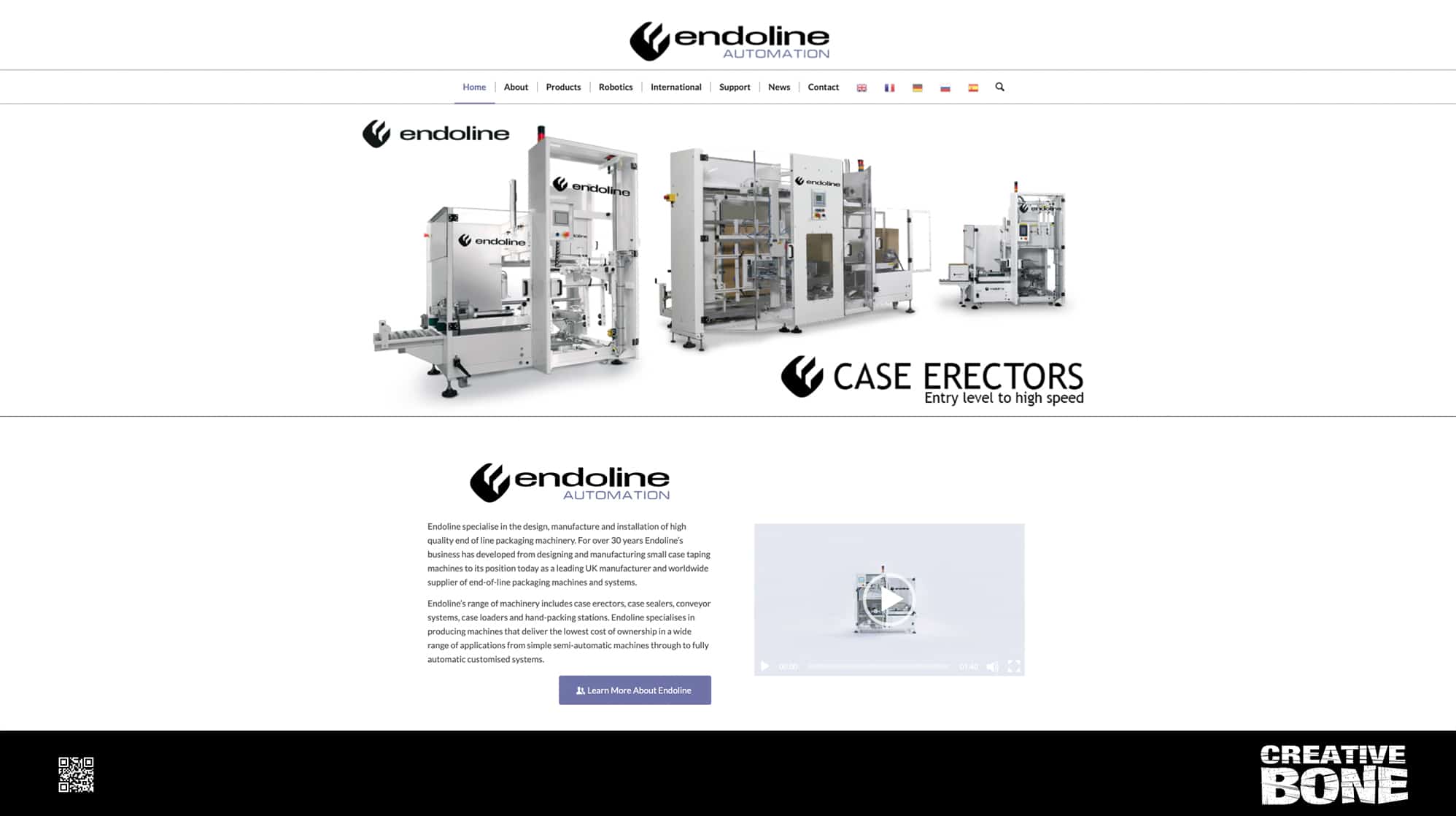
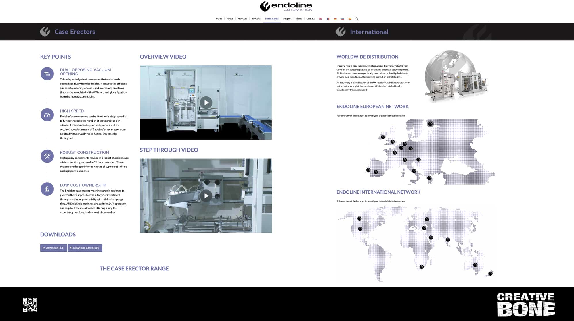
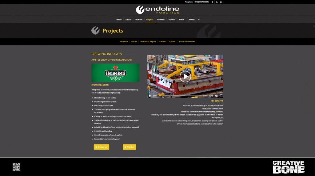
With the announcement that Endoline were creating their sister company, Endoline Robotics, we were tasked with updating the Endoline website. The client wanted to maintain the structure of the original site but bring the new branding into play. Clean and stylish with a Yin/Yang feel to complement the darker grey tones of Endoline Robotics, we bought new life to the website with simple nips and tucks, a refined colour palette and cohesive branding with the Endoline Robotics website.

https://endoline-automation.com


Travel the world and through time

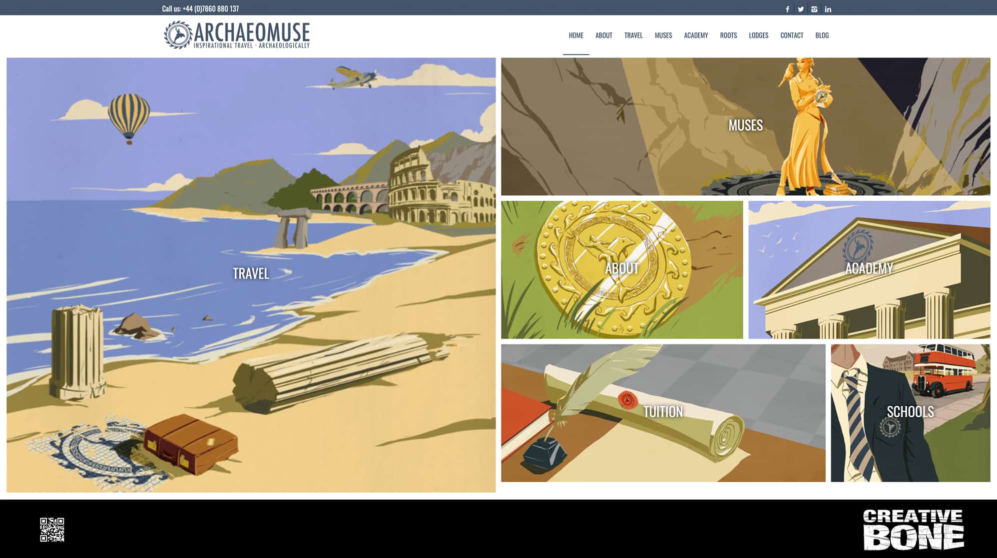
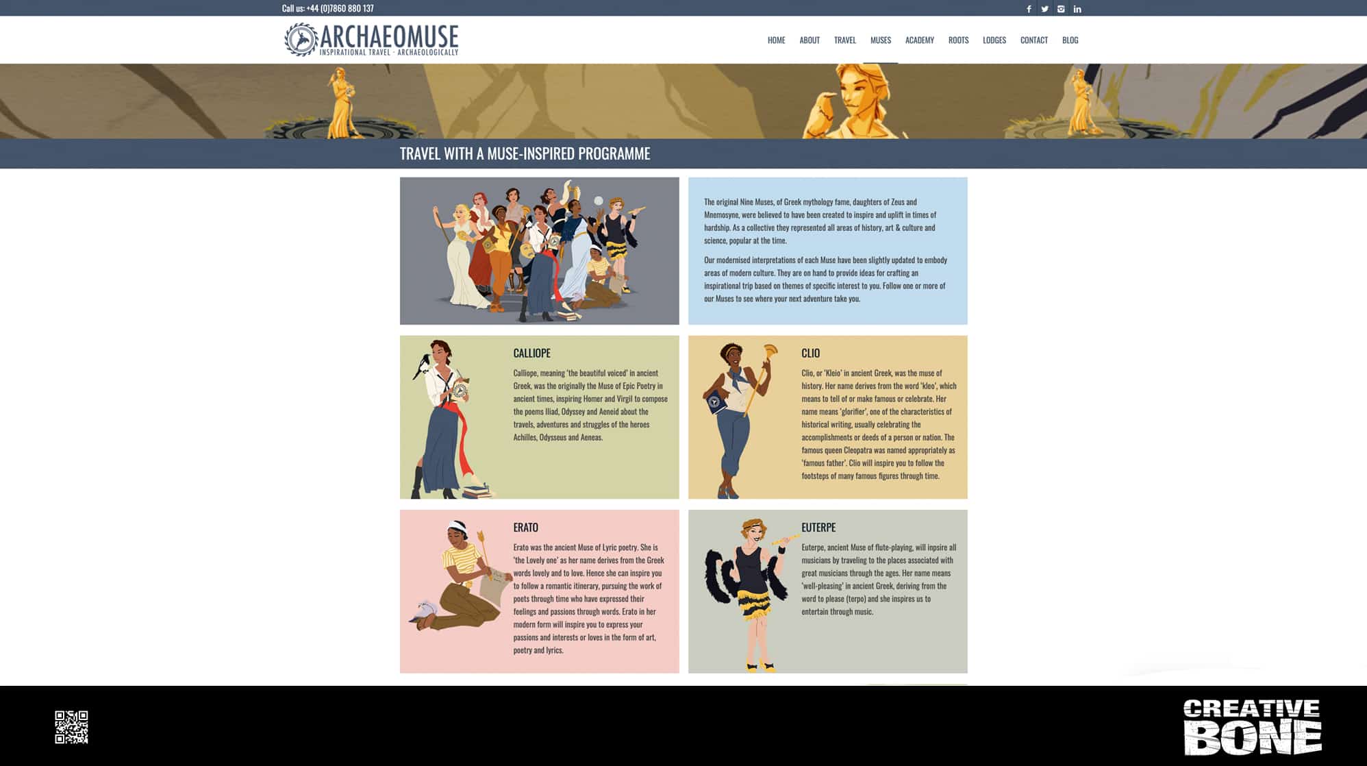
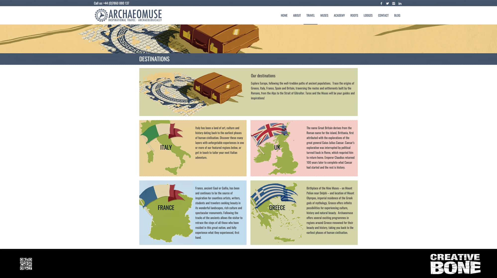
We were asked by educational travel experts – Archaeomuse, to build their brand-new website. Not a small task by any means, we worked closely with the client as well as super talented artist David Cousons to create this original and informative website that shows just whats on offer to those who are looking for that something extra from their holidays. Not content with laying on a beach for two weeks, create a bespoke holiday package that takes in the wonders of the world whilst exploring the history of these great locations.

https://archaeomuse.com


The robots are coming!!

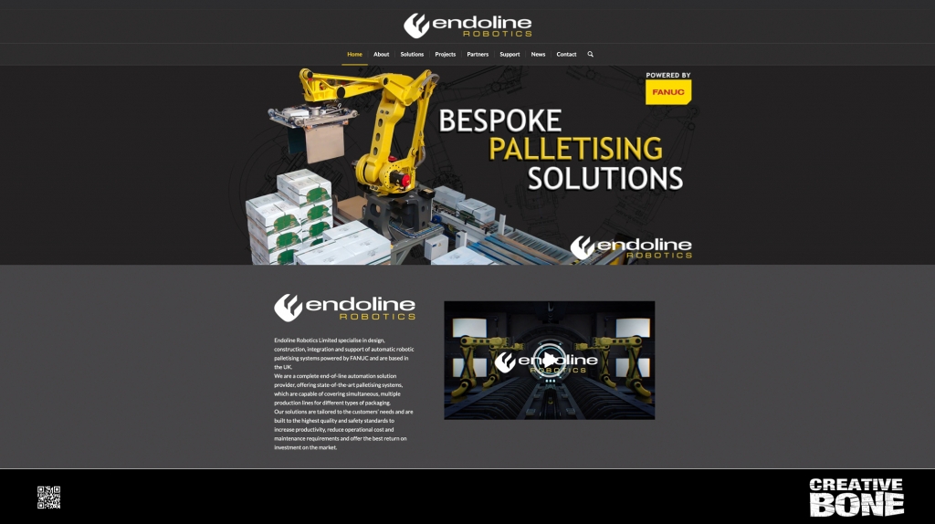
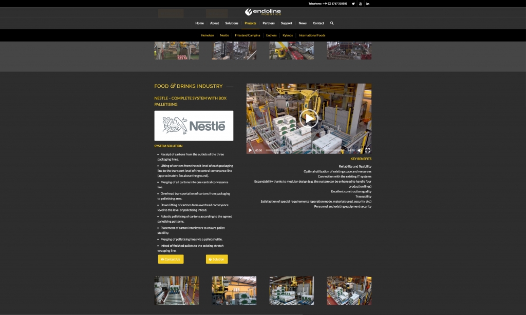
Having a long-standing creative relationship with Endoline, we were tasked with bringing life to their brand-new business – Endoline Robotics. They wanted everything to scream Endoline but at the same time be something new and fresh. Keeping with the existing logo template we created various logo updates and colour palettes before settling on the chosen grey, white, black and yellow. The website had to have all the functionality of Endoline Automation but have an updated and refined feel to it. The end result sits very comfortably as a partner site to the original Endoline Automation site but with an identity all of its own.
https://endoline-robotics.com/contact/

Website set in stone

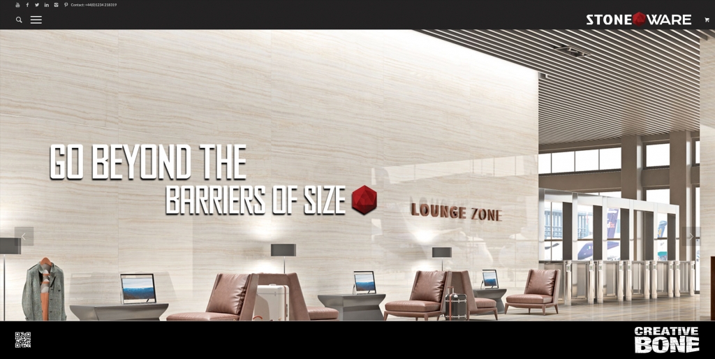
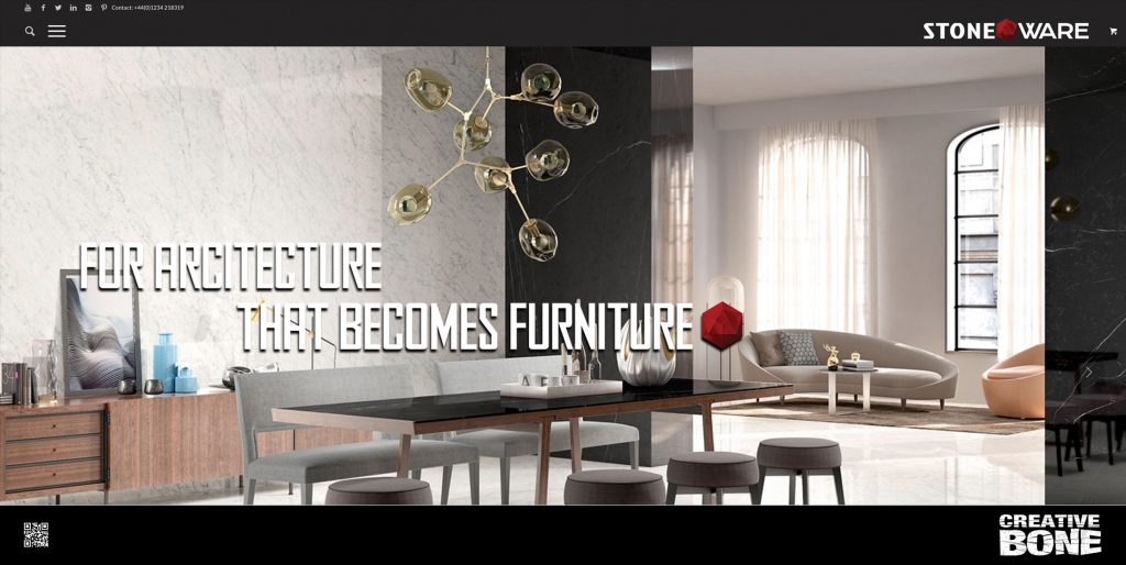
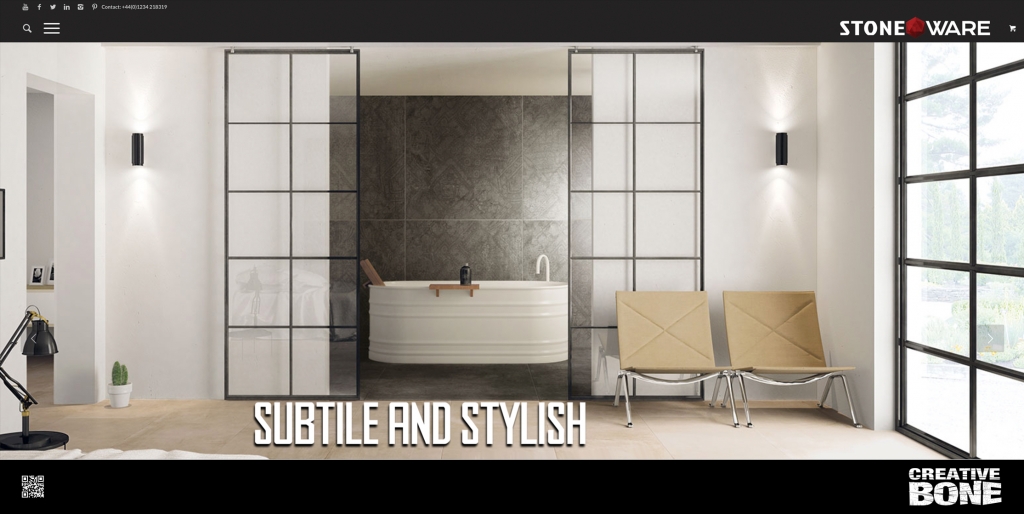
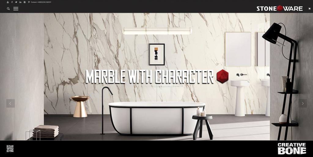
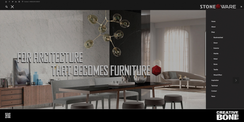
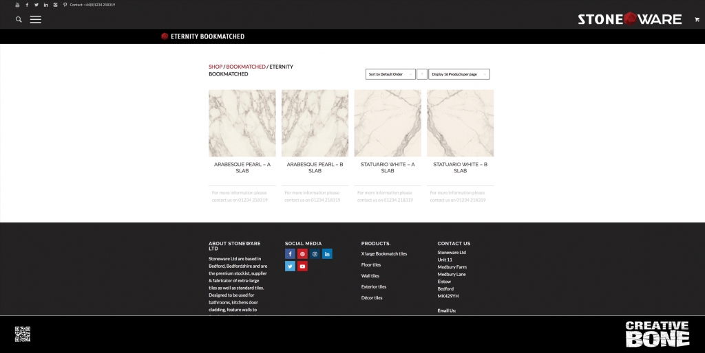
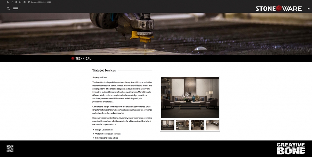
Stoneware came to us to produce a website and online shop for their range of extra-large wall and flooring tiles. We helped create the brand identity and defined the colour palette before constructing a clean and contemporary website that is easy to navigate and order from.

https://stonewareltd.co.uk


Grey is the new Black

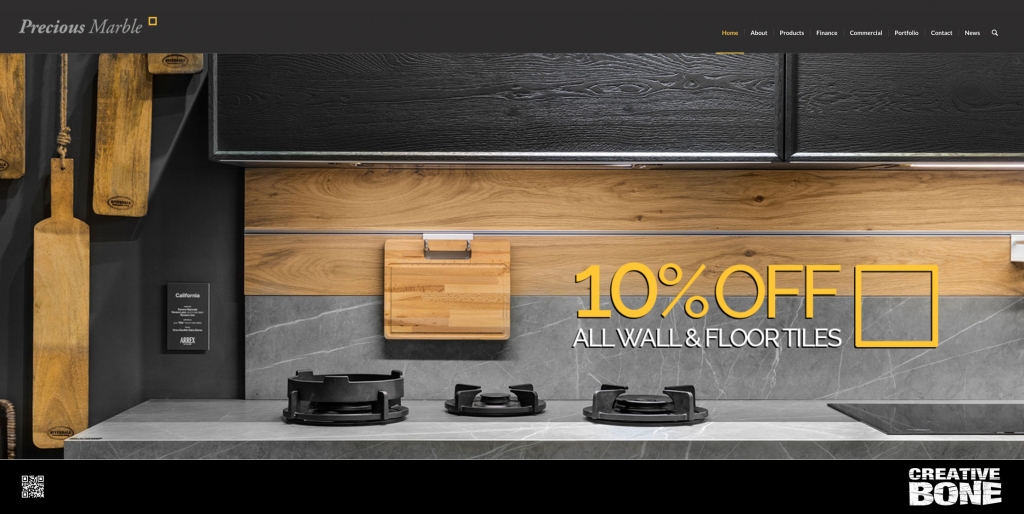
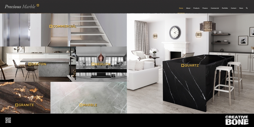
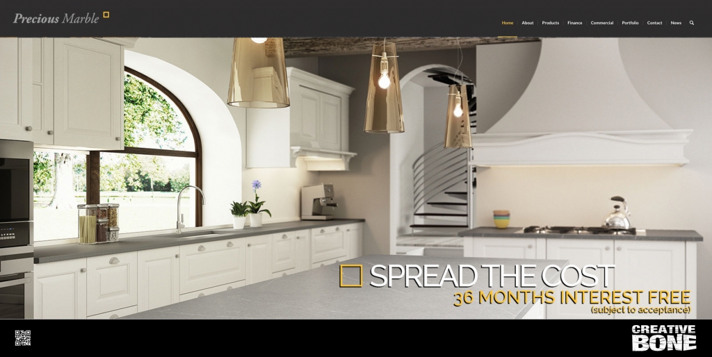
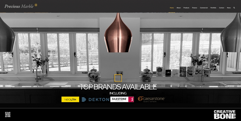
Long standing client Precious Marble came back to us for a website refresh. We had built their existing site over five years ago and they decided to give the site an update and a new homepage. We designed a mosaic frontpage with links to all the main assets up front and centre, went for a modern and contemporary grey background with a mix of grey shades to compliment and kept the brand yellow to punctuate the logo and calls to actions.

The client was very happy, there was zero downtime and the site looks and operated superbly on both desktop and mobile.
https://preciousmarble.co.uk


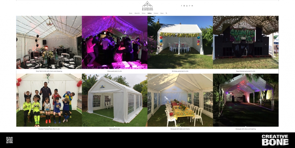
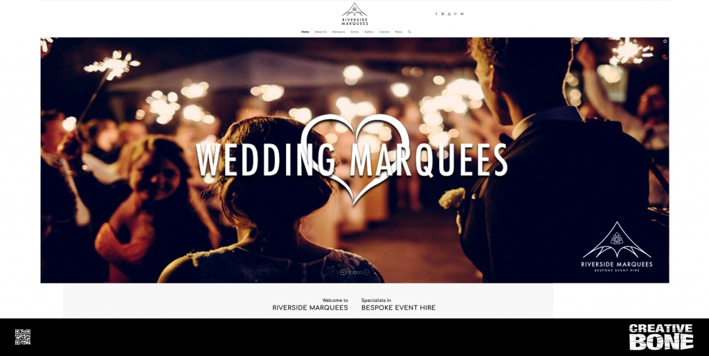
Erecting A Website For Riverside Marquees

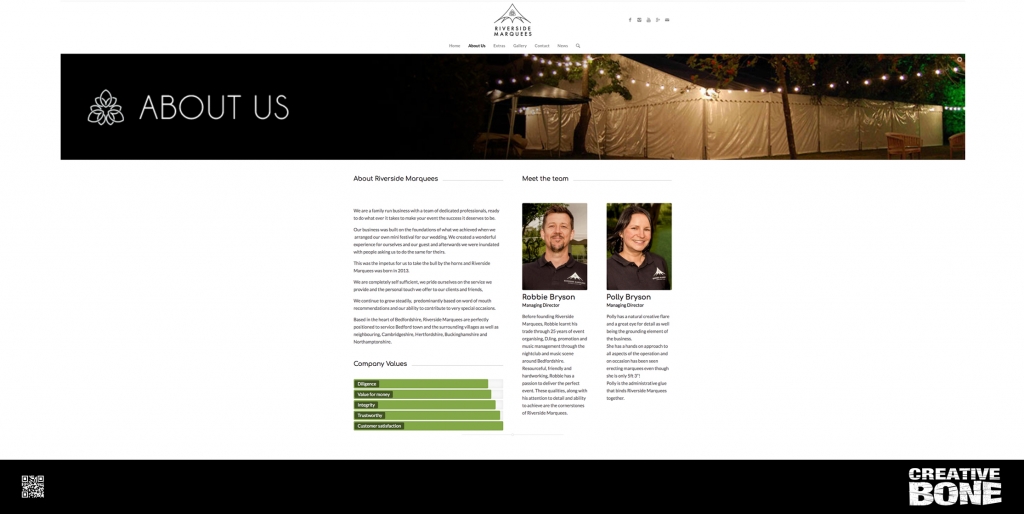
We were recently asked by Bedford based bespoke event hire company, Riverside Marquees to design and build a website to compliment their new branding.  The business has been growing steadily over the last few years and they have built an ever evolving portfolio of new and existing clients, as well as a vast collection of marquees, tents and decorative flourishes and lighting.

The main aim was that they wanted a clean and informative site, filled with imagery. Obviously they needed the site to be responsive for mobile devices and easy to navigate, search engine friendly and a solid foundation they could build on as the business grew.

We created a site that is user updatable, so the client can adjust text, add images and post news without having to call us in, which saves on added expense. We implemented a secure SSL service, meaning that site is secure. This is a big issue for most new browsers as they detect insecure websites and some may even stop browsing of a site.  The website is also  GDPR compliant.

As the business grows and the additions become more complicated, we will be happy to come back in an update to their requirements, but until then the site is completely set for them to maintain on their own.

The clients were over the moon with the end product and we look forward to them moving up the Google ladder over the coming weeks.


The Beauty Of Beautology

Creative Bone produced a brand new website design, build and hosting facility for the for aesthetic and medical laser manufactures Beautology Limited. We worked with the client to create a clean and concise  website that incorporated the companies aesthetic and built content that exceeded the clients expectations with a page one ranking, higher than even the manufacturers. The Bedford based company provide extensive service in the repair and maintenance of laser, IPL and high end cosmetic systems.
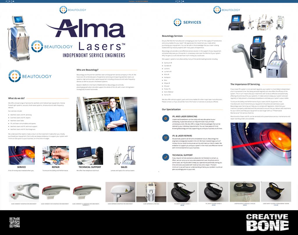
http://www.beautologylaser.com


Its pays to be precious….

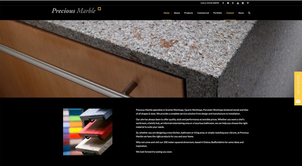
Our long standing relationship with Bedford based granite and porcelain suppliers Precious Marble, continued earlier this year when we were asked to redesign their existing website and add a whole host of new products and features. Take a look and if you’re in need of some outstanding worktops or tiles, drop them a line.

precious-website

click here to view

Arcade Madness….

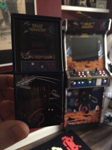
We all need to let off steam and no better way than so retro arcade classics….well that and a little bit of Father Ted….


One is small, the other is far away……

creative-bone-arcade-machine

https://www.youtube.com/watch?v=dS12p0Zqlt0